

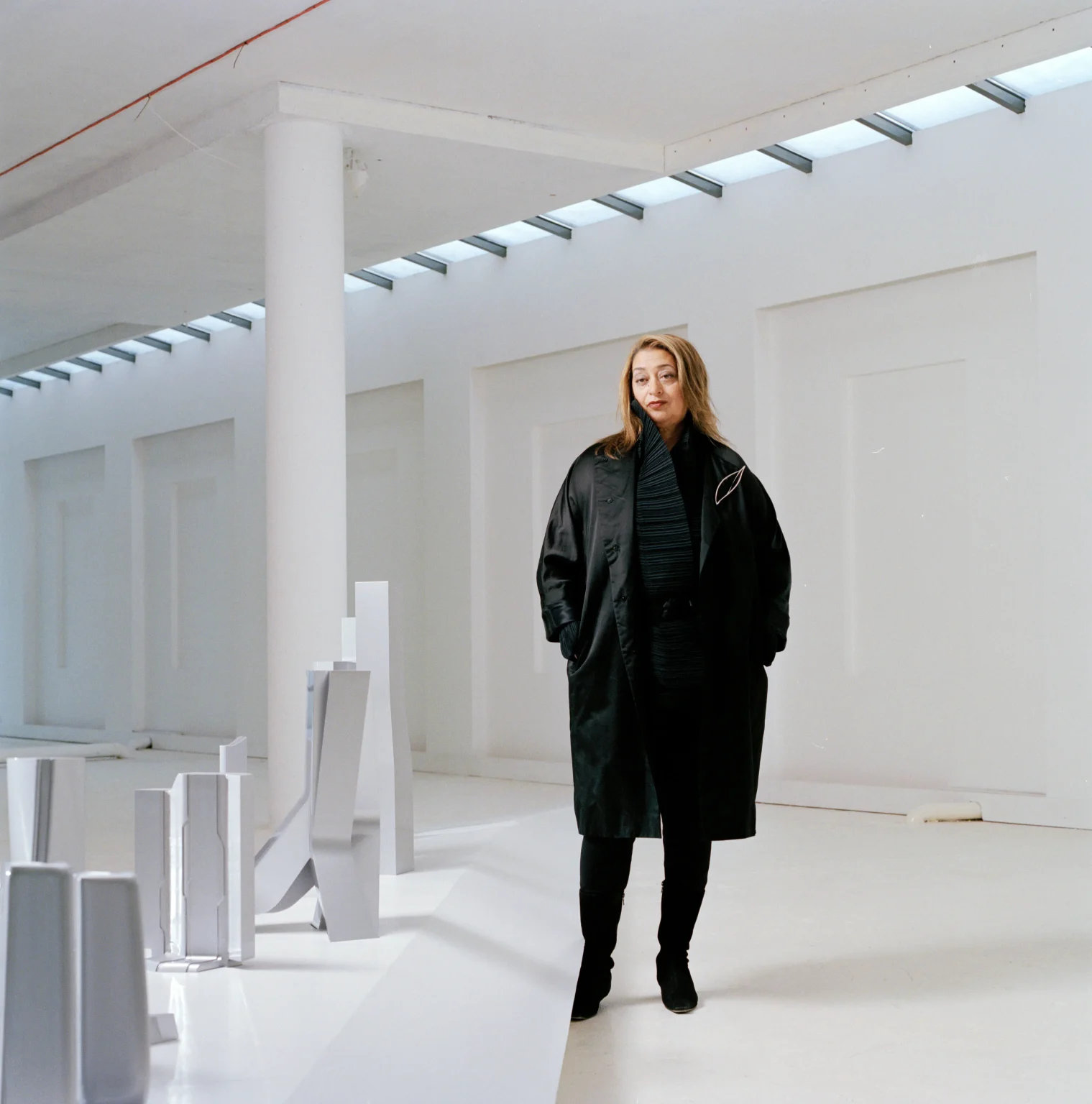


Zaha Hadid was born in Baghdad on October 31, 1950. She studied mathematics at the American University of Beirut before moving to London in 1972 to study at the Architectural Association. There, she worked under Rem Koolhaas and Elia Zenghelis, then joined their practice, OMA. She opened her own London office in 1979.
Her reputation began with drawings and paintings. In 1983, she won the competition for The Peak in Hong Kong. The project was never built, but her fractured, dynamic compositions drew on Russian Suprematism and Constructivism and changed how architects thought about representation. In 1988, the Museum of Modern Art included her in its Deconstructivist Architecture exhibition. For years she was labeled a “paper architect,” since few of her designs were built.
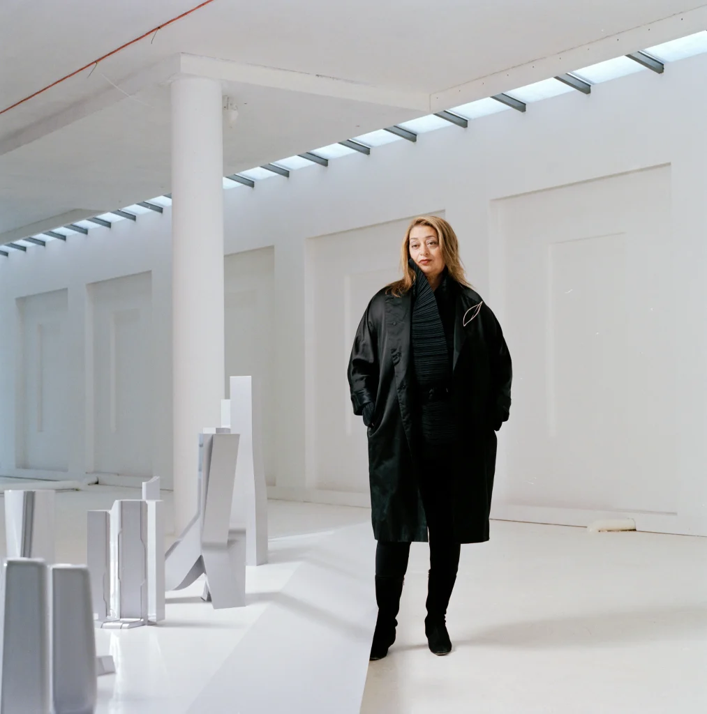
That changed with the Vitra Fire Station, completed in 1993 when she was in her early 40s. Over the next two decades, her office, Zaha Hadid Architects, delivered museums, bridges, stadiums, towers, and infrastructure on several continents. Her recognition included the Pritzker Architecture Prize in 2004, the first awarded to a woman. She won the RIBA Stirling Prize in 2010 for MAXXI and in 2011 for Evelyn Grace Academy, and was made a Dame in 2012. In 2016, she became the first woman to receive the RIBA Gold Medal in her own right.
The 15 projects below showcase her architectural design evolution in four stages.
Stage 1: Early Experimentation
Fragmented geometry, landscape, and spatial continuity.
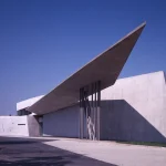
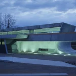
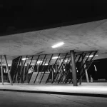
1. Vitra Fire Station, Weil am Rhein, Germany (1993)
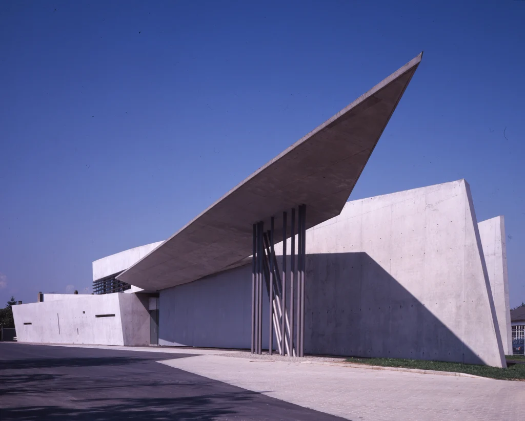
Zaha’s first completed building was commissioned after a fire damaged the Vitra furniture factory in 1981. The site needed its own fire station, and the client asked for a building that would also act as an edge for the campus. She made a long, narrow concrete building that runs along the site boundary. Its walls tilt, fold, and converge, and its roof planes project over the fire engine bays. The program includes engine bays, offices, changing rooms, and a training room, arranged in sequence along the length of the building. The exposed concrete was cast in place, which required tight tolerances for the sharp angles.
She described the building as movement frozen in a single instant, and visitors see that in the leaning planes and cantilevers. The geometry carries the influence of Malevich and the Russian avant-garde, which she had explored in her paintings. The fire brigade no longer operates from the building. It now hosts exhibitions and events on the Vitra Campus, alongside works by Frank Gehry, Tadao Ando, and Álvaro Siza.
2. LF One / Landscape Formation One, Weil am Rhein, Germany (1999)
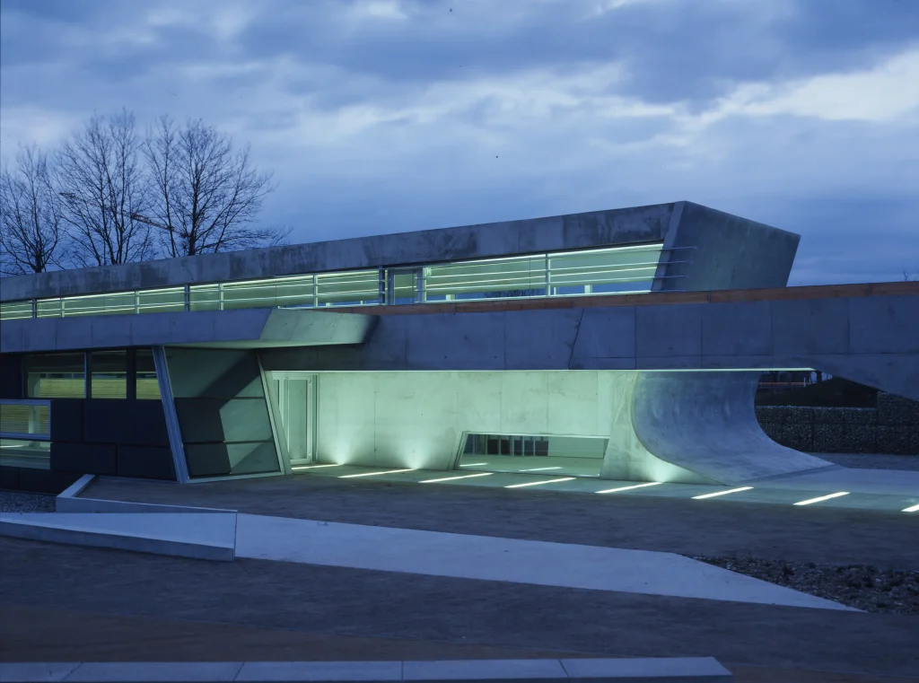
LF One was built for the 1999 Landesgartenschau, a state garden festival. Zaha treated the pavilion as part of the terrain. Linear concrete bands run in parallel across the site and bend as they meet each other and the ground. A path rises and becomes a wall, then a roof, so the floor, wall, and ceiling are one continuous surface. The result is a set of covered and open spaces that visitors move through without a clear threshold between landscape and building.
The project extends the diagonal thinking of the Fire Station. The Fire Station is one object with sharp edges. LF One spreads that geometry across a field and uses it to organize circulation. The approach later appeared in her larger cultural projects, where interior and exterior paths follow the same flowing logic.
3. Hoenheim-Nord Terminus and Car Park, Strasbourg, France (2001)
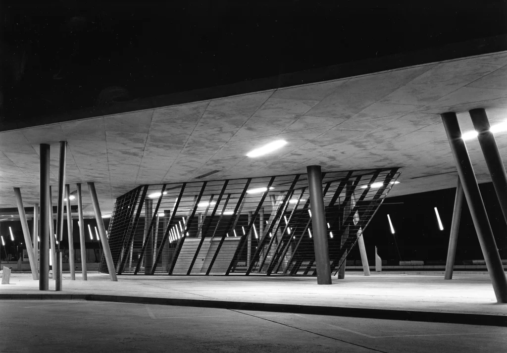
This tram terminus and park-and-ride, sized for roughly 700 cars, shows that Zaha applied her language to everyday infrastructure. The design treats the parking stripes as a graphic field. Lines of painted bays flow toward the tram platform and become part of the composition. Over the cars, a light canopy of curved planes in concrete, steel, and glass gives shelter and defines the route to the tram.
The project turns a typical suburban car park into a place with a clear identity. It is also an early example of her interest in speed and flow. Drivers, pedestrians, and trams move through a layout that guides them intuitively. For architects, Hoenheim-Nord shows how a restrained budget and a utilitarian program can still produce a coherent spatial concept.
Stage 2: Movement and Integration
Streamlined forms, interconnected programs, and human-scale spaces.
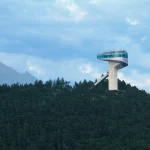
4. Bergisel Ski Jump, Innsbruck, Austria (2002)
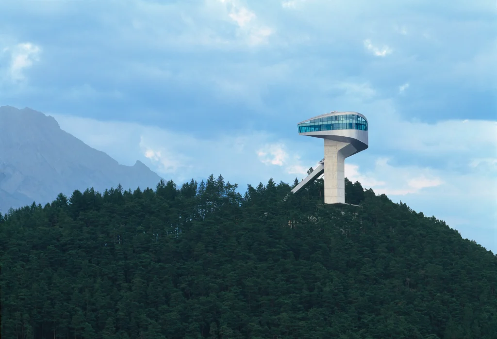
The new Bergisel Ski Jump replaced an earlier jump used in the 1964 and 1976 Winter Olympics. It is also a stop on the Four Hills Tournament. Zaha combined the tower and the ramp into a single sweeping form. A concrete tower rises from the hill, and a steel structure continues from it as the in-run. The two read as one gesture. A lift takes visitors to a café at the top, where glazing opens views of Innsbruck and the Alps.
The building is both sports infrastructure and a public viewing platform. Compared with the Vitra Fire Station, the geometry is smoother. The sharp, colliding planes give way to a streamlined profile shaped by function and speed. This simplification became a defining feature of her mid-career work.
5. BMW Central Building, Leipzig, Germany (2005)
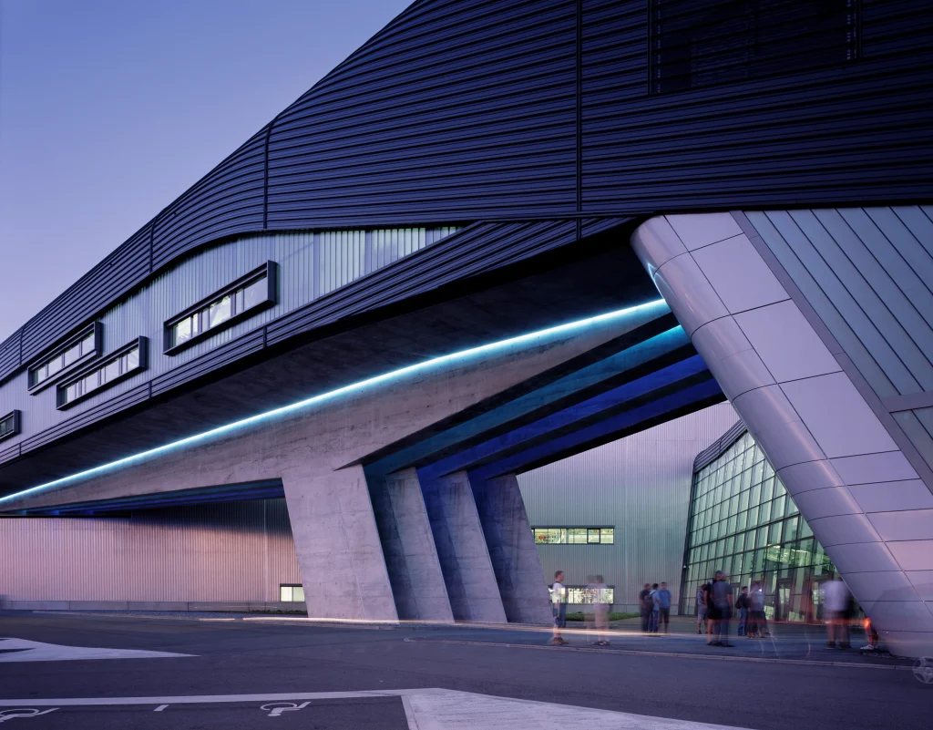
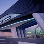
The Central Building sits at the heart of the BMW plant in Leipzig and connects the production halls. Zaha organized it so that office workers and the assembly process share the same space. Car bodies travel on overhead conveyors through the building, passing above desks and public areas. Employees see the vehicles in progress during the workday, which supports communication between departments. Stepped floor plates and open levels create views across the interior, and the structure combines concrete and steel with a cantilevered roof edge.
The project moves her work from isolated objects to integrated systems. The building acts as a social hub for the plant, with the assembly line as its main organizing element. It also shows how her office could handle industrial clients with demanding programs.
6. Ordrupgaard Museum Extension, Charlottenlund, Denmark (2005)
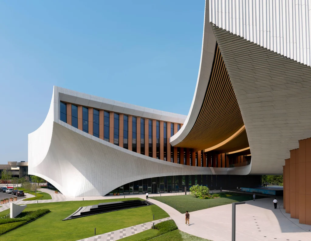
Ordrupgaard is a museum with French Impressionist works and Danish Golden Age paintings. It sits in a 1918 house set in a park north of Copenhagen. The extension added galleries, a café, and an auditorium. Zaha kept the new building low and let it follow the contours of the park. Its dark concrete and glass volume sits beside the historic house and does not compete with it. Curved walls guide visitors through the galleries, and openings frame views of the garden.
The contrast in material and form between the two buildings is deliberate. The older house keeps its character, and the extension adds a contemporary layer. This was one of her early lessons in working with existing heritage, a skill she used again in later projects.
7. Maggie’s Center Fife, Kirkcaldy, Scotland (2006)
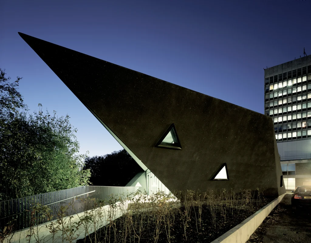
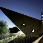
Maggie’s Centers provide free support to people affected by cancer. Each one is meant to feel domestic and welcoming, not clinical. The Fife center sits in the grounds of Victoria Hospital and was her first project in Scotland. Zaha made a compact building with an angular, folded form. The exterior is dark, and the interior is white and filled with daylight. Large openings frame views of the landscape, and an open plan around a kitchen encourages visitors to gather.
The scale is far smaller than the Bergisel Ski Jump or the BMW Central Building. The project shows that her geometry could create calm, protective rooms. Its focus on light, orientation, and informal use is a useful reference for designing health and care spaces.
Stage 3: Complex Structures
Bridges, towers, public infrastructure, and large roof systems.
8. Zaragoza Bridge Pavilion, Zaragoza, Spain (2008)
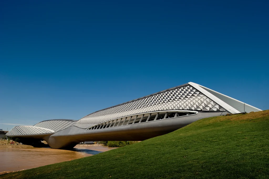
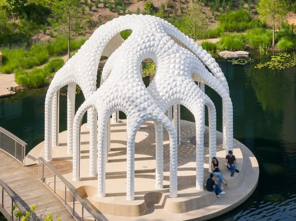
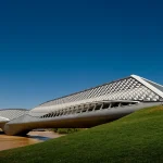
Built for Expo 2008, the Bridge Pavilion crosses the Ebro River and links the Expo site to the city. At about 270 meters long, it is both a bridge and an exhibition building. The structure is a covered tube-like form divided into four sections. Each section is shaped by structural needs and by the program inside. The skin is made of many small triangular elements that wrap the entire surface, creating a faceted, scaled appearance. Visitors walk through the interior and see the river from different positions.
The project joins architecture and infrastructure in one object. It required close coordination between structural engineers and fabricators, since the geometry changes along its length. It reflects the shift in her office toward parametric design and digital fabrication.
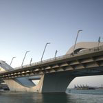
9. Sheikh Zayed Bridge, Abu Dhabi, UAE (2010)
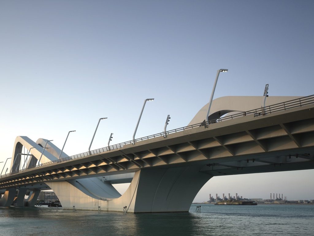
The Sheikh Zayed Bridge connects Abu Dhabi Island to the mainland across the Maqta Channel. It is about 842 meters long, and its steel arches reach up to roughly 64 meters. The arches rise and fall in a wave pattern along the deck. The shape was designed as a movement, since the curves change as drivers pass beneath and beside them. The pattern is also structural. The arches carry loads to the foundations while giving the bridge an identifiable profile from far away. At night, dynamic lighting changes the appearance of the arches.
The bridge shows her ability to design at the scale of the city. It is a major piece of transport infrastructure that also works as a landmark. Compared with the Zaragoza Bridge Pavilion, the geometry is simpler and bigger.
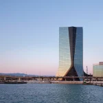
10. CMA CGM Tower, Marseille, France (2011)
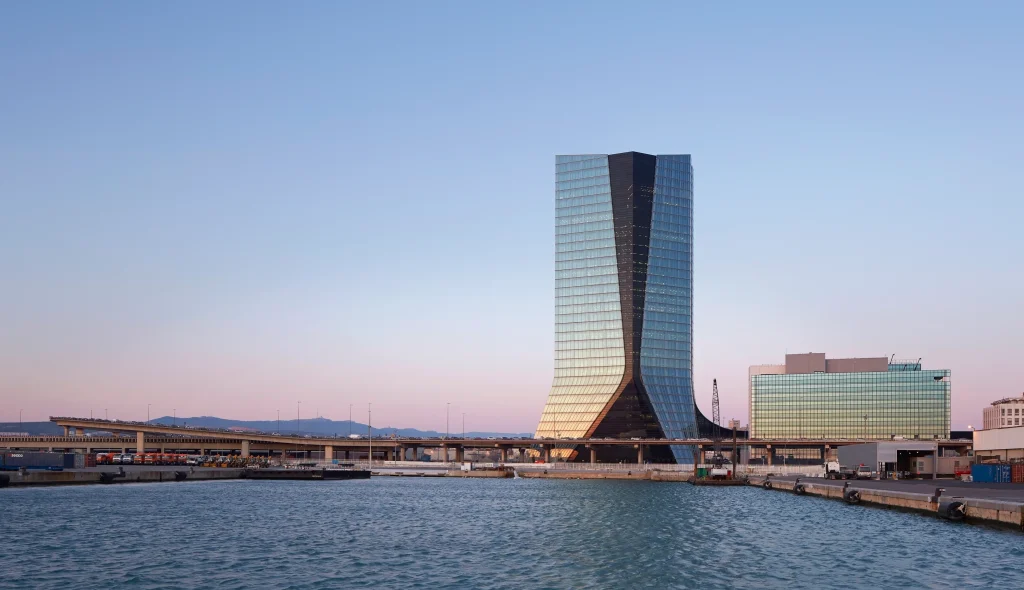
The CMA CGM Tower is the headquarters of a global shipping company. It rises 147 meters over 33 floors and is one of the tallest buildings in Marseille. Zaha shaped the tower with a bent, sculpted profile. A glazed facade wraps the volume, and a lower section links the tower to the ground and the surrounding streets. The curved geometry responds to sun and wind and reduces the sense of bulk that a large office block can have. The building’s position near the port ties it to the city’s maritime identity.
The tower brings her fluid language to the high-rise type. Office towers have strict structural and efficiency requirements, so the design balances those with the curved form. It also helped define the new waterfront district of Euroméditerranée.
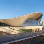
11. London Aquatics Center, London, United Kingdom (2011)
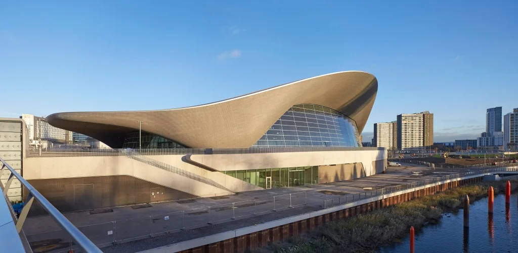
The London Aquatics Center was built for the 2012 Olympic and Paralympic Games in Queen Elizabeth Olympic Park. The concept is based on water in motion. The roof is the main feature. It is a single wave-shaped structure about 160 meters long, supported at only three points, which leaves the interior columns-free. Inside, there is a 50-meter competition pool, a diving pool, and a warm-up pool. A timber lining on the ceiling gives the large hall a warm finish.
During the Games, temporary wings on each side raised capacity to 17,500 seats. After the Games, the wings were removed, and the center now holds about 2,500 spectators and serves the public. This approach to legacy planning is an important lesson for large event buildings.
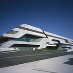
12. Pierresvives, Montpellier, France (2012)
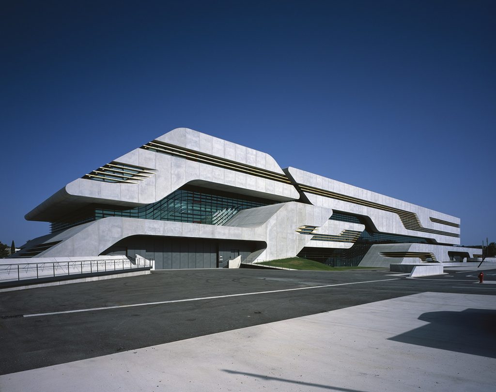
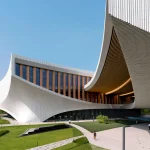
Pierresvives, meaning “living stones,” houses the departmental archives, a library, and sports services for the Hérault Department. Combining those three programs in one building was part of the brief. The building is a large horizontal block of concrete and glass, with floor plates that extend and project at different levels. A cantilevered volume reaches toward the city, and an interior atrium connects the three functions. The facade uses a grid with openings of varied sizes that control light and views.
Archives, libraries, and sports facilities do not usually share a building, and Zaha treated them as parts of one civic institution. Concrete is the main material, and the design shows how she used it at a large scale with controlled, repeated geometry.
Stage 4: Context and Refinement
Historic adaptation, landscape integration, and interior experience.
13. Serpentine Sackler Gallery, London, United Kingdom (2013)
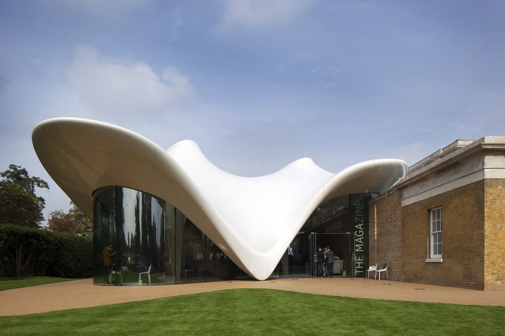
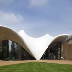
The gallery occupies the Magazine, a gunpowder store built in 1805 in Kensington Gardens. The building is Grade II listed. Zaha restored the original structure and added a new extension. The extension is a curved structure with glass walls and a tensile fabric roof that forms a series of undulating peaks. It houses a restaurant and event space. The new wing is lightweight and translucent, which contrasts with the heavy brick of the Magazine. The two connect through a clear threshold, so the historic building remains legible.
Compared with the Ordrupgaard extension, this project shows greater confidence in combining old and new. The material choices keep the extension subordinate to the setting, and the fabric roof adds little weight to the park.
14. Messner Mountain Museum Corones, South Tyrol, Italy (2015)
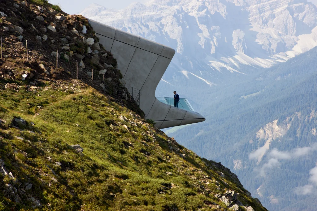
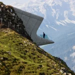
Corones is the sixth and final museum in Reinhold Messner’s Messner Mountain Museum network. It sits on the summit of Kronplatz, at about 2,275 meters, and focuses on traditional mountaineering. Most of the museum is built into the mountain. Visitors arrive by cable car and enter a concrete structure that is largely buried, so it has little effect on the summit’s profile. A sequence of galleries leads through the interior, and the route ends at large cantilevered windows that project from the rock. These windows frame panoramic views of the Dolomites.
The project integrates architecture with the landscape more completely than LF One. The building responds to altitude, weather, and the visitor’s route. The geometry is restrained, and the concrete is detailed. For architects, it shows how a strong concept can limit visual impact in a sensitive environment.
15. Mathematics: The Winton Gallery, Science Museum, London, United Kingdom (2016)
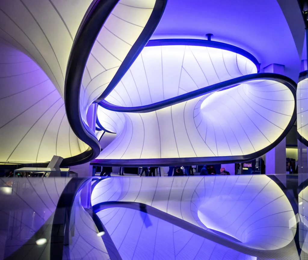
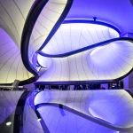
This gallery opened in December 2016, after Zaha’s death. It is an interior project, and it connects to her early studies in mathematics. The design is based on the mathematics of airflow. The curved lines of air moving around a 1929 Handley Page aircraft, which hangs in the gallery, shaped the layout. Display cases and furniture follow these lines, and the cases hold about 100 objects from the museum’s collection that show how mathematics has influenced science, trade, and art over 400 years.
The gallery turns a theoretical idea into a visitor route. Its white, curved cases feel continuous with the architecture, and the layout invites movement through the space. The project closes the story of the 15 buildings with a return to mathematics, the subject she studied before architecture.
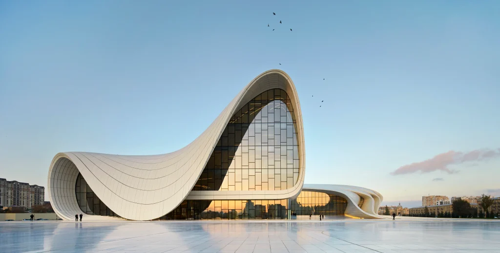
Three factors explain Hadid’s standing. She worked from a consistent geometric language and refined it with each commission. She pushed structural engineers, fabricators, and software to build forms that others considered unbuildable. She also treated public buildings and infrastructure as seriously as cultural landmarks.