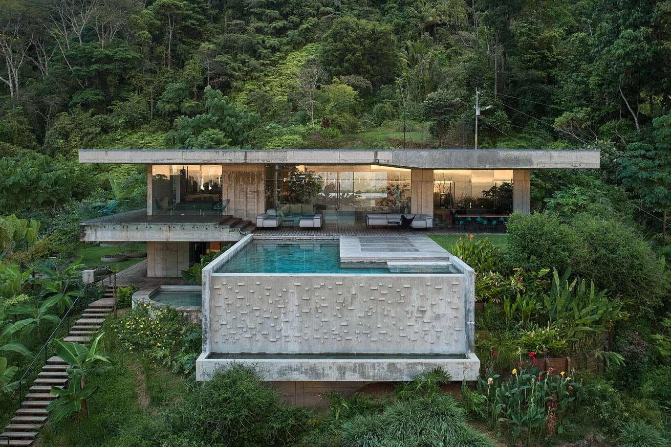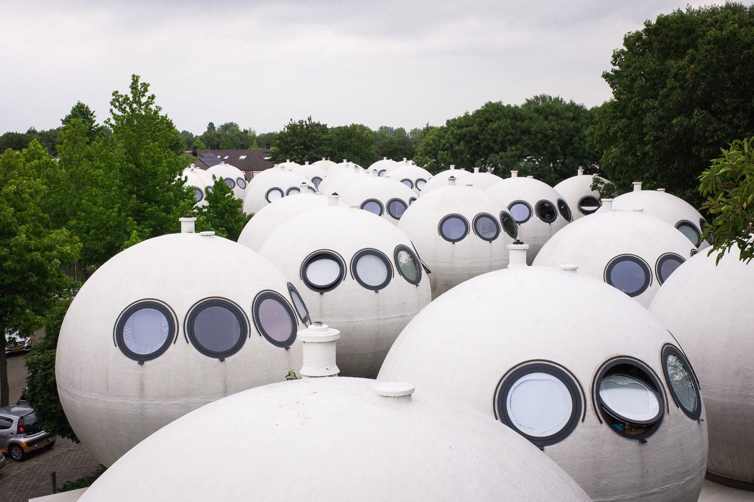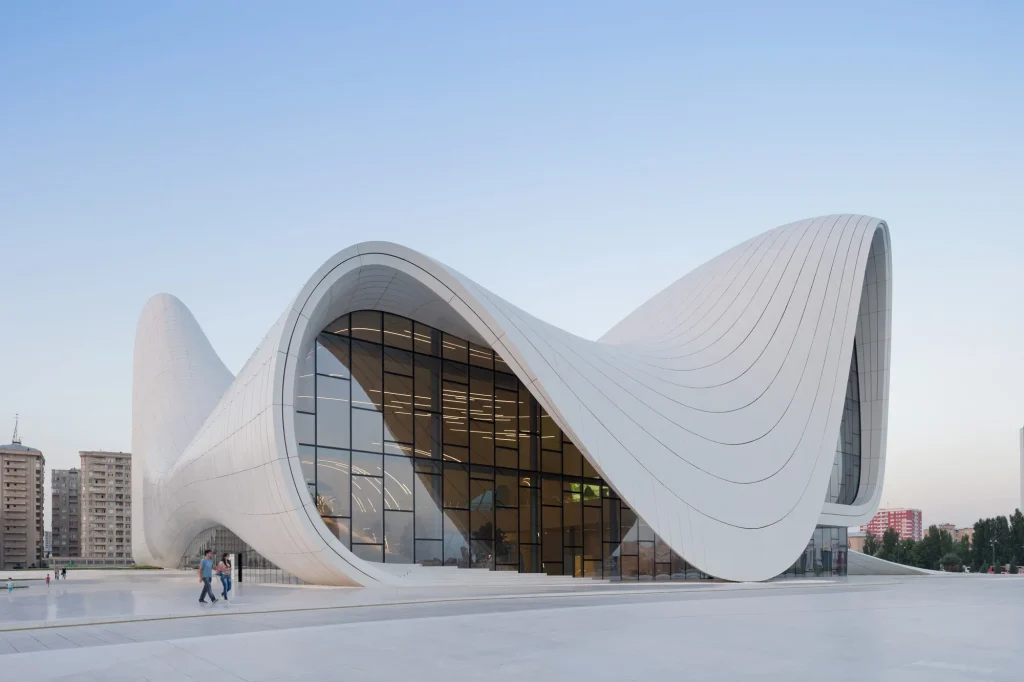


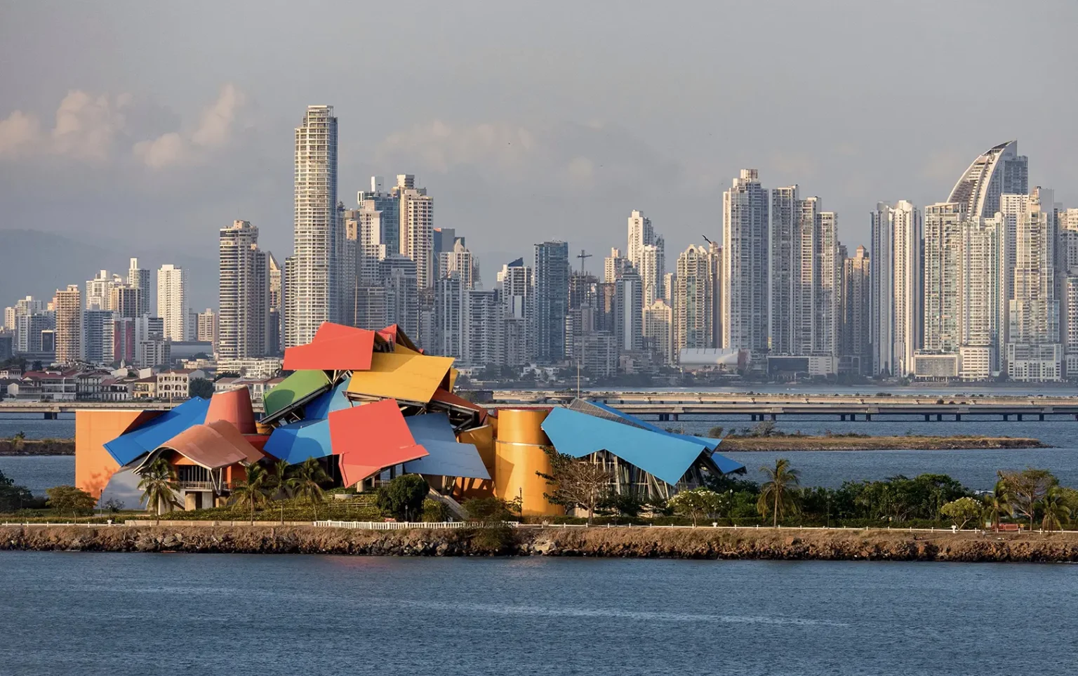
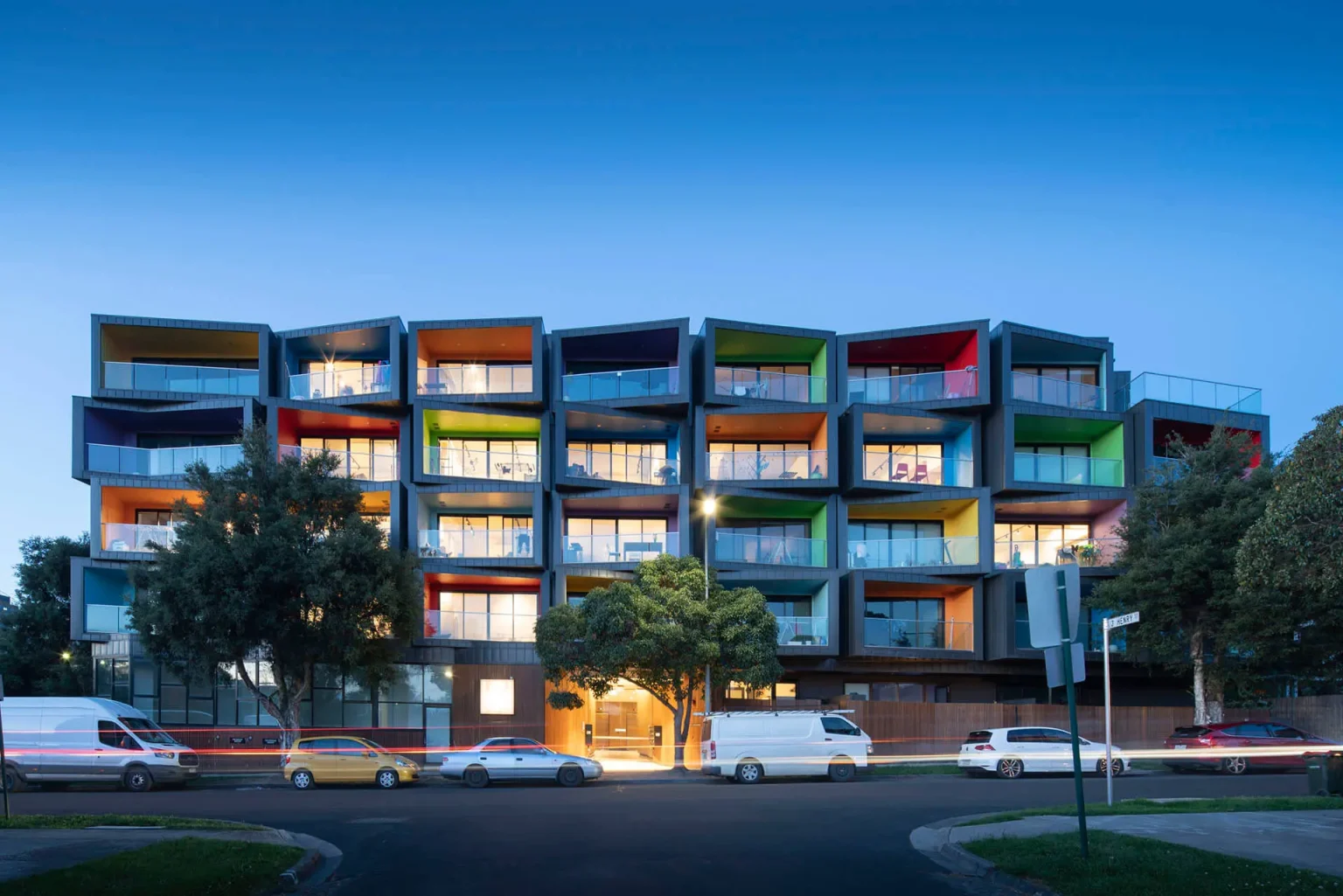


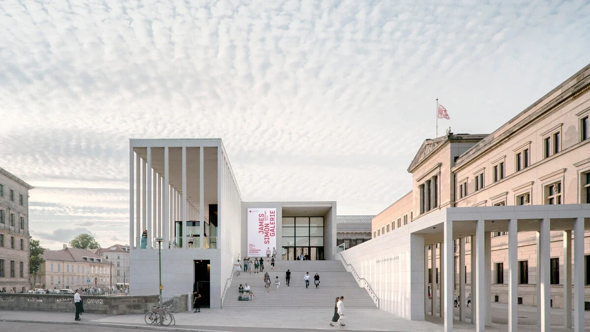


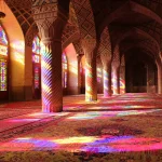
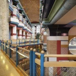
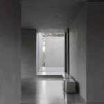
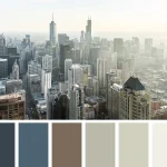

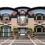
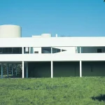


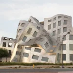
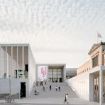
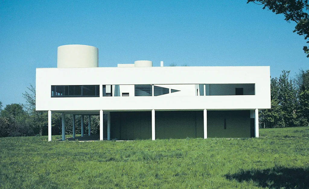
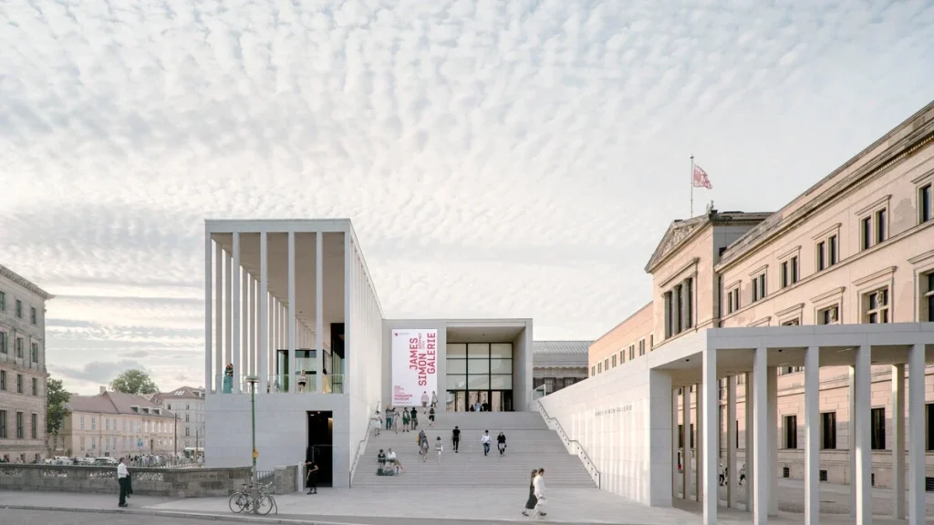
Walk through almost any major contemporary city and a particular visual condition becomes increasingly difficult to ignore. Concrete is exposed, façades are white, window frames are black, stone is pale, interiors are beige, and public spaces are dominated by gray paving. New residential developments arrive as carefully composed volumes of glass, steel, concrete, and neutral-colored panels. Offices, galleries, hotels, cafés, and luxury apartments frequently share the same restrained chromatic vocabulary.
Individually, these buildings may be sophisticated and rigorously designed. Collectively, however, they reveal a broader transformation in architectural culture: the gradual normalization of monochromatic environments.
This does not mean that contemporary architecture has completely abandoned color. There are important examples of architects using saturated façades, colored glass, ceramics, painted metal, and expressive interiors. Nor was modern architecture historically as white and colorless as its conventional image suggests. Research into early modernism demonstrates that architects including Le Corbusier, Gerrit Rietveld, Bruno Taut, and Theo van Doesburg actively incorporated color into architectural composition.
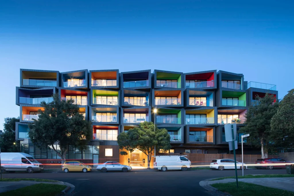
Nevertheless, the dominant visual language of contemporary architecture remains remarkably restrained.
The question, therefore, is not simply why are contemporary buildings gray? The more important question is why neutrality has become associated with architectural sophistication, while color is so often regarded as superficial, decorative, commercial, or even childish.
This is not merely an aesthetic issue. Color is an architectural instrument. It affects spatial perception, orientation, identity, emotional response, material expression, and the relationship between buildings and their urban context. Contemporary research confirms that color significantly influences the perception of architecture and urban space, while also contributing to cultural identity and the legibility of environments.
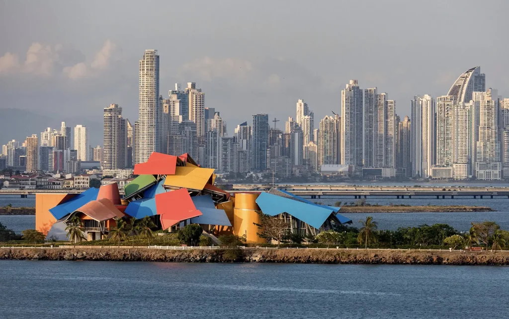
The disappearance of color from architecture is therefore worth examining as a cultural and professional phenomenon.
From Polychromatic Traditions to Architectural Neutrality
For much of architectural history, color was inseparable from the experience of space.
Traditional architecture rarely understood buildings as isolated objects whose surfaces needed to remain visually neutral. Color was embedded within material culture, craft, ornament, climate, religion, and everyday life. Ceramic tiles, painted plaster, brick, stone, timber, textiles, stained glass, vegetation, and shadow produced complex chromatic environments.
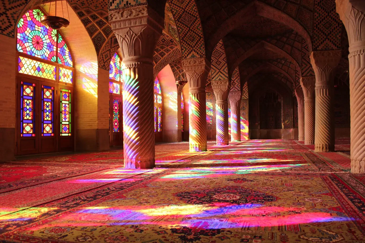
Persian and Islamic architecture, for example, developed sophisticated relationships between geometry, ornament, light, and color. Turquoise, cobalt, ochre, white, green, and earth tones were not simply applied to make buildings visually attractive. They participated in the symbolic and spatial organization of architecture.
Similar principles can be observed across numerous architectural traditions. Mediterranean settlements often combine white surfaces with intense colors in doors, shutters, ceramics, textiles, and vegetation. Indian architecture developed highly elaborate chromatic and ornamental traditions. Traditional architecture across Latin America, North Africa, Southeast Asia, and the Middle East similarly demonstrates that color can operate as an integral component of place identity.
In these environments, architecture did not necessarily aspire to neutrality.
It aspired to specificity.
A building communicated where it belonged.
Color could establish a relationship between architecture and landscape, between private and public space, or between ordinary and ceremonial environments. It could identify a neighborhood, reinforce cultural memory, or simply create visual pleasure.
Modern architecture fundamentally altered this relationship.
Modernism and the Ethics of Reduction
Modernism emerged from a desire to establish a new architectural language appropriate to industrial society. Its rejection of historical ornament was part of a larger intellectual project involving rationalization, technological innovation, functionalism, structural expression, and new methods of construction.
The modernist preference for volume, abstraction, structural clarity, and minimal ornament eventually became strongly associated with neutral palettes. RIBA’s description of modernism identifies minimal ornamentation, reinforced concrete, steel, curtain walls, open plans, and a tendency toward white or neutral colors among its characteristic features.
Yet the relationship between modernism and color was considerably more complex.
The familiar image of modern architecture as uniformly white is, to a significant extent, a historical simplification. Research on modernist color identifies several distinct approaches, including the chromatic systems associated with Le Corbusier, Expressionism, and De Stijl. Color was used not only as surface decoration but to define planes, modify spatial perception, emphasize geometry, and transform architectural form.
The critical distinction is that modernism did not necessarily eliminate color. It rationalized it.
Color became part of an architectural system. The difficulty came later, when the modernist aesthetic was reduced to a much simpler visual formula: white walls, exposed concrete, glass, steel, and carefully controlled details. The intellectual complexity disappeared while the aesthetic image remained.
When Minimalism Became a Global Style
Minimalism has considerable architectural value. Reduction can clarify structure, strengthen spatial relationships, intensify the experience of light, and eliminate unnecessary visual noise. There are environments where restraint is precisely what creates architectural quality.
But contemporary minimalism presents a different problem when it becomes standardized. The same materials and palettes now circulate globally through architectural publications, design platforms, real-estate marketing, hospitality brands, furniture companies, and social media. The result is a form of aesthetic globalization.
A luxury apartment in London can resemble one in Dubai. A boutique hotel in Tokyo can resemble one in Copenhagen. A contemporary villa in Tehran can begin to resemble one in Los Angeles.
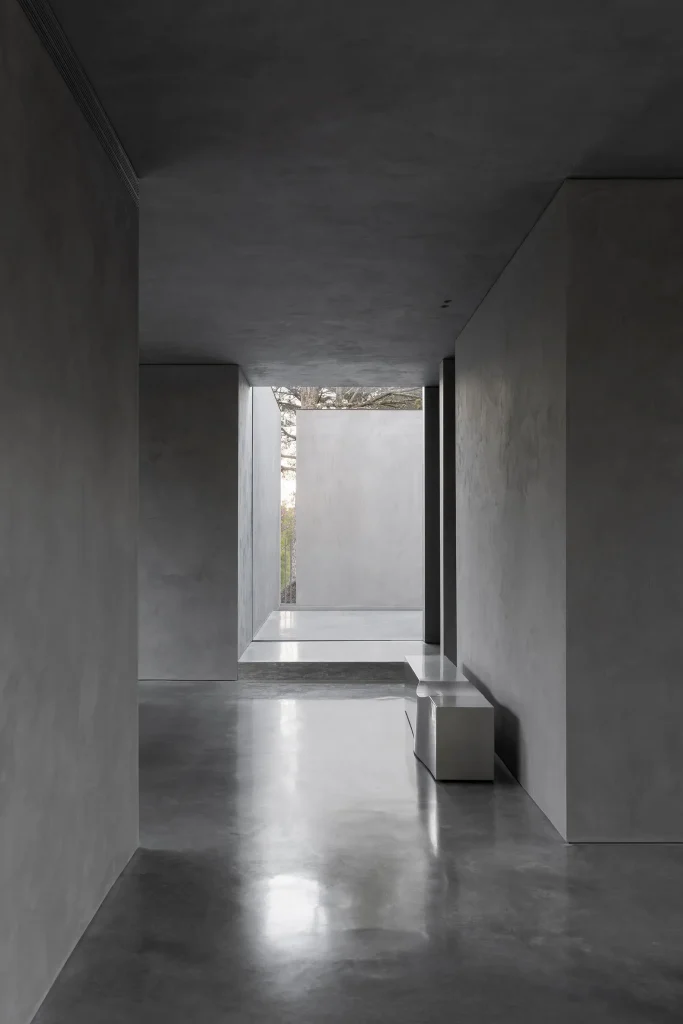
The local climate, craft traditions, material culture, and urban history may differ dramatically, yet the visual language remains remarkably consistent.
Concrete, Black metal, Clear glass, Natural oak, Travertine, Beige upholstery, Green plants. The plant, naturally, has been assigned the enormous responsibility of proving that the monochromatic interior is still alive.
This is where minimalism becomes problematic. It is no longer simply an architectural methodology. It becomes a marketable image. The neutral building is easily photographed, easily branded, easily reproduced, and easily incorporated into international property markets. Neutrality becomes commercially convenient.
The Postmodern Interruption
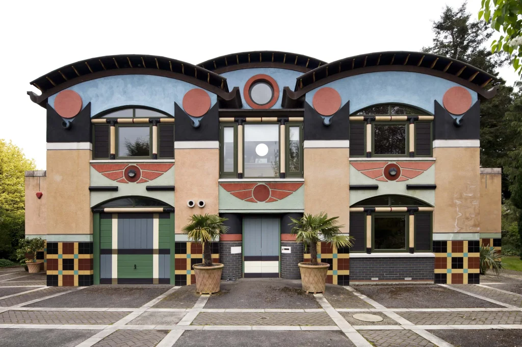
Postmodernism represented one of the most significant challenges to this condition. Emerging partly as a critique of modernist orthodoxy, postmodern architecture reintroduced historical references, symbolism, ornament, irony, complexity, contradiction, and popular culture. Color was an important component of this broader departure from modernist restraint.
RIBA explicitly characterizes postmodern architecture as eclectic and colorful, describing it as a reaction against the doctrines and perceived limitations of modernism.
Architects such as Robert Venturi, Michael Graves, Charles Moore, Ricardo Bofill, and others questioned the idea that architecture needed to be visually pure or intellectually austere.
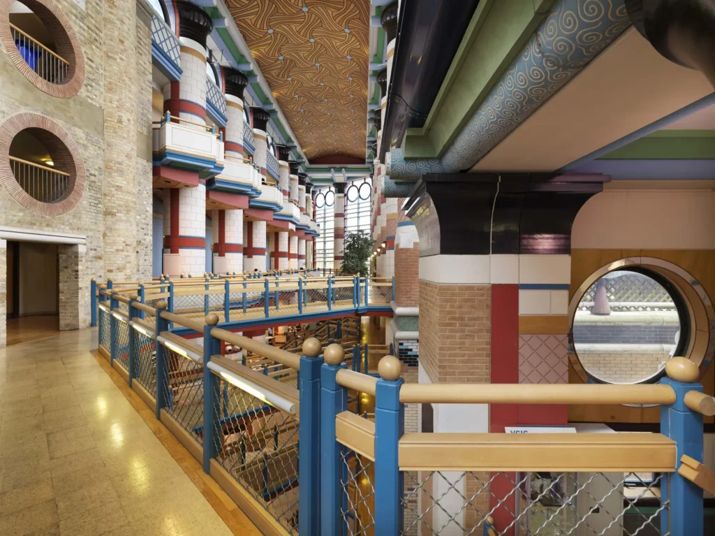
Buildings could communicate. They could reference history. They could be theatrical. They could be ambiguous. They could even be entertaining.
Research into postmodern Western architecture demonstrates that color played a significant role in architectural composition from the 1960s through the 1990s, across different phases of postmodern and late-modern experimentation. Postmodernism therefore reopened an important architectural question: Why should seriousness require visual restraint?
Yet postmodernism eventually generated its own problems. Some projects reduced historical references to superficial imagery. Some uses of color became excessively commercial. Ornament could become arbitrary. Architecture could become a form of visual packaging.
The reaction was predictable. The profession returned to restraint. The white box returned. The gray box followed. And the colorful city gradually became unfashionable.
The Contemporary White, Black, and Gray Box
Today, the neutral palette has become so deeply embedded in architectural culture that it often requires no explanation.
White is perceived as pure. Black is sophisticated. Gray is timeless. Beige is warm. Natural stone is authentic. Color, meanwhile, must justify its existence.
This creates an unusual asymmetry in architectural criticism. A gray building can simply be described as elegant, refined, restrained, or timeless. A yellow building is often expected to explain itself. Why yellow? Color is required to provide an argument.
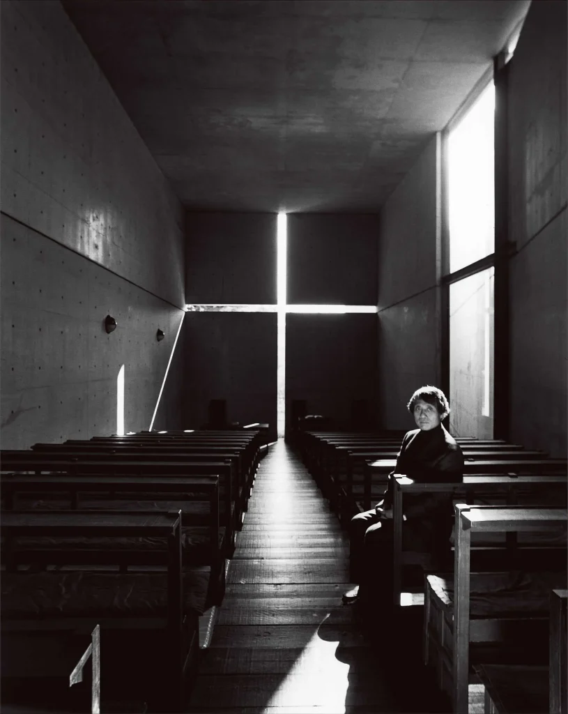
Neutrality is allowed to remain silent. This distinction is culturally significant. It suggests that neutrality is not actually neutral. It is a value system. It privileges abstraction, restraint, permanence, and professional control. Color, by contrast, can introduce emotional intensity, cultural specificity, informality, and unpredictability.
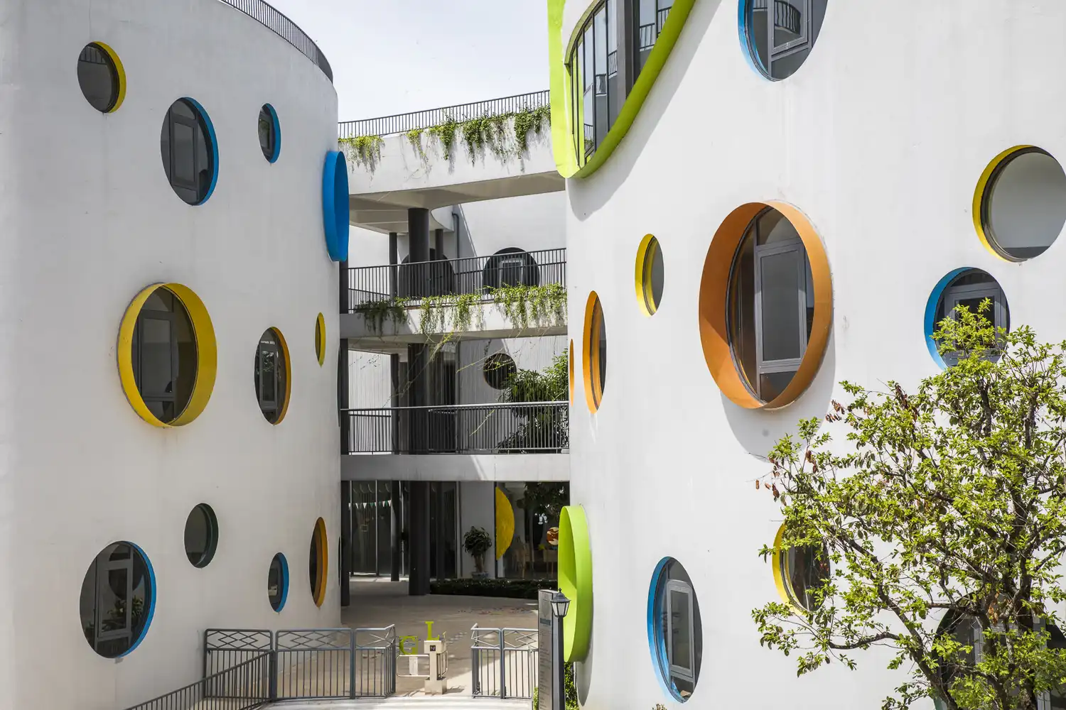
This may explain why color frequently survives most comfortably in spaces associated with children, entertainment, commercial branding, or temporary installations. In many contemporary contexts, intense color is considered appropriate for spaces where playfulness is expected but less acceptable in environments associated with prestige and institutional authority. The implication is uncomfortable: Perhaps contemporary architecture has confused seriousness with emotional restraint.
Color as an Architectural Instrument
From a professional architectural perspective, color should not be understood simply as paint. Color can be embedded in materiality. Light itself modifies color. Consequently, architectural color is inseparable from material, daylight, texture, scale, and context.
Research into architectural perception emphasizes that color influences how people understand spatial and material characteristics and that its effects depend on environmental conditions, lighting, context, and individual perception. Color can therefore perform several architectural functions.
It can establish hierarchy by distinguishing entrances or circulation routes. It can improve wayfinding. It can emphasize structural elements. It can break down the apparent scale of large façades. It can establish a relationship between a building and its surrounding landscape. It can reinforce cultural identity.
Recent research into public-space color similarly identifies relationships between color, psychological response, place identity, functional zoning, wayfinding, and environmental adaptation. This means that color should not be added at the end of the design process as a cosmetic decision. It should be integrated into the architectural concept.
The Problem of the “Timeless” Building
One of the strongest arguments for neutral architecture is that it is supposedly timeless. But what does timelessness actually mean?
A gray stone building may age beautifully. A white façade can remain visually relevant for decades. Neutral materials can provide flexibility for occupants and reduce the risk of aesthetic fatigue.
If every building is designed to avoid appearing dated, architecture may gradually lose its relationship with time altogether. Historical architecture is often recognizable precisely because it belongs to a particular period. Its materials, colors, proportions, ornament, and construction methods reveal when and where it was produced.
A city without such visual distinctions becomes increasingly difficult to read historically. Architecture starts behaving like a neutral consumer product. The building is designed to remain marketable rather than memorable.
The Fashion Parallel
The same cultural phenomenon can be observed in fashion. Contemporary clothing culture has increasingly embraced neutral wardrobes: black, white, gray, beige, cream, navy, brown, and muted earth tones. The rise of minimalist wardrobes and “quiet luxury” has reinforced the idea that sophistication is associated with understatement.
Again, there is nothing inherently wrong with neutral clothing. Black can be elegant. Beige can be sophisticated. White can be dramatic. The problem occurs when the aesthetic becomes normative.
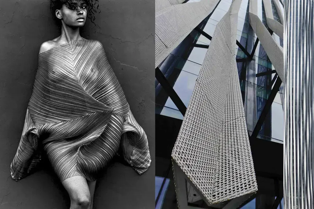
Architecture and fashion increasingly share the same visual logic. Both have developed an attraction to clean silhouettes, muted palettes, minimal branding, natural materials, and controlled expression.
The body becomes another architectural surface. Black tailoring resembles dark façades. Beige knitwear resembles limestone. Gray sweatshirts resemble concrete. The language of restraint moves between clothing, interiors, architecture, automobiles, product design, and digital interfaces. This is more than a coincidence. It reflects a broader cultural preference for controlled visual identity.
We increasingly want individuality, but we also want our individuality to conform to a recognizable aesthetic. Humanity has somehow managed to turn nonconformity into a standardized product category.
Is Gray Actually the Problem?
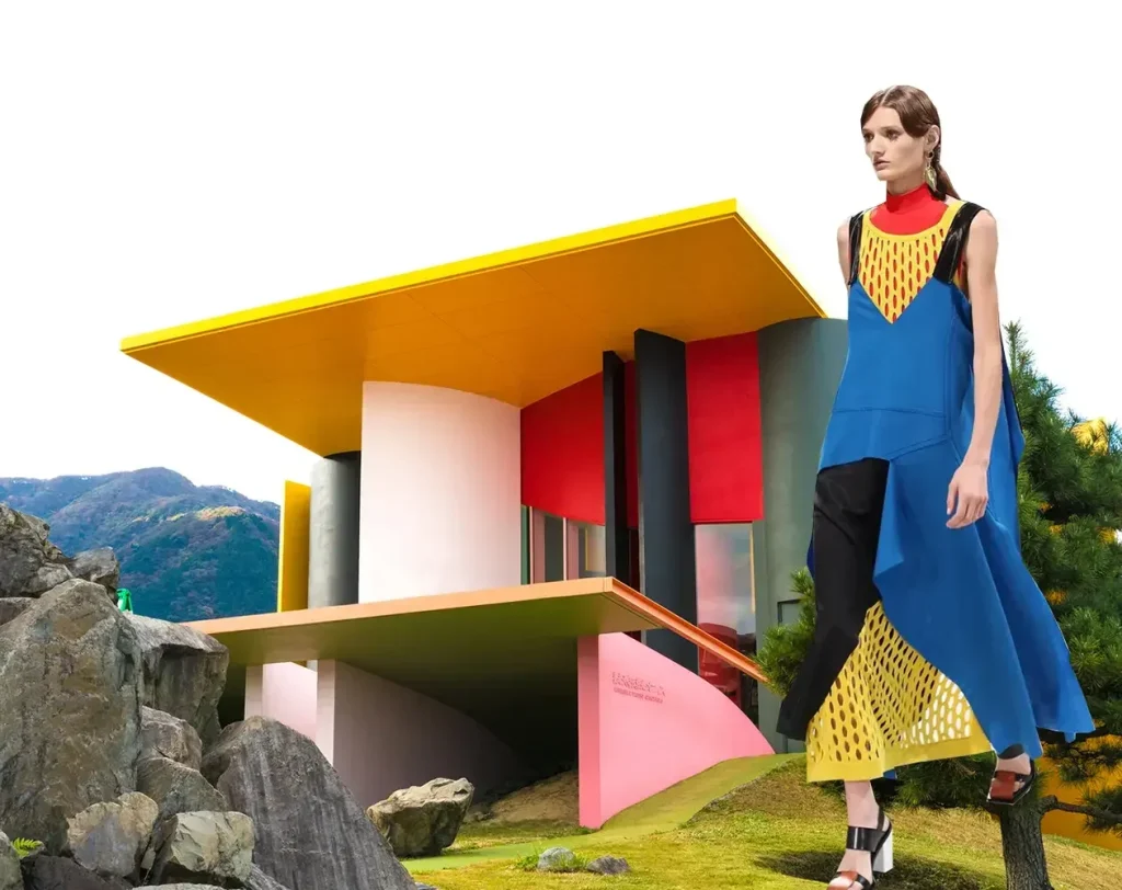
It would be too simplistic to argue that contemporary architecture should simply become more colorful.
A city filled entirely with saturated colors would not necessarily be successful. Excessive chromatic intensity can produce visual disorder. Color choices that ignore context can weaken rather than strengthen urban identity. Poor material selection can lead to fading, deterioration, and maintenance problems.
Color must therefore be designed with the same rigor applied to structure, proportion, materiality, and environmental performance. The objective should not be more color. It should be better color.
A restrained architectural composition can incorporate a single saturated surface. A housing project can use differentiated tones to improve orientation. A public building can use colored glass to modify daylight. A school can develop a chromatic system that supports identity and wayfinding. A cultural building can employ color to establish a relationship with local artistic traditions.
The point is not to reject minimalism. It is to reject chromatic monotony.
Toward a Contextual Chromatic Architecture
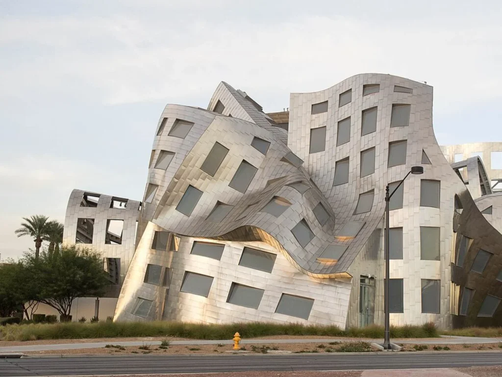
The most productive direction for contemporary architecture may lie somewhere between the extremes of postmodern exuberance and minimalist neutrality.
What is needed is not a return to the decorative excesses of the past, but a more sophisticated understanding of chromatic context.
Architecture should ask where its colors come from. What materials are indigenous to the region? What colors belong to the local landscape? How does daylight transform the façade? How do seasonal changes affect perception? What cultural associations does a particular color carry? How does the building contribute to the existing urban palette? How can color improve orientation and spatial legibility? These questions transform color from decoration into architectural strategy.
Urban color is also closely connected to collective memory and cultural identity. Research in urban color studies emphasizes that color can be understood not only objectively but through the subjective associations and historical meanings that inhabitants attach to their environments. This is particularly important in rapidly globalizing cities.
If every new development adopts the same neutral architectural vocabulary, the city becomes increasingly interchangeable. A contextual approach to color offers an opportunity to resist this homogenization without resorting to historical imitation.
From Monochrome to Chromatic Pluralism
The future of architecture should therefore not be understood as a choice between colorful maximalism and gray minimalism. The more valuable alternative is chromatic pluralism.
Some buildings should remain white. Others should remain concrete gray. Some should use black as a dominant architectural element. Others should employ terracotta, cobalt, ochre, green, yellow, or deep red. Some should disappear into their landscapes. Others should become urban landmarks. A mature architectural culture should be capable of accommodating all of these possibilities.
The real danger is not gray architecture itself. The danger is when gray becomes the default expression of architectural intelligence.
The history of architecture demonstrates that color has never been merely ornamental. Modernism explored it through abstraction and spatial composition. Postmodernism used it to challenge modernist orthodoxy. Traditional architecture embedded it within culture, material, craft, and place.
Contemporary architecture now has the opportunity to reconsider it once again. Perhaps the question is not whether the world is literally turning gray. It is whether architecture has become too afraid of being visibly alive.
In an age defined by digital saturation, globalized aesthetics, and increasingly standardized urban development, the deliberate use of color can become an act of architectural specificity. It can restore difference to streetscapes, strengthen local identity, improve spatial legibility, and reintroduce emotional depth into environments increasingly dominated by neutral surfaces.
The objective should not be to paint the city in every color imaginable. It should be to give architecture permission to have a color again. Because a city is not a showroom. It is a lived environment. And lived environments should contain more than black, white, and 50 shades of gray.