

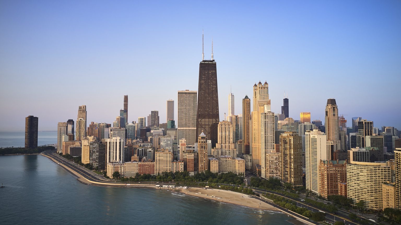





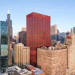
Chicago began as a trading post and military site on Lake Michigan’s southwestern shore. The Potawatomi, Miami, and other Native nations lived in the area long before the city built Fort Dearborn in 1803. The city was incorporated in 1837, and the Illinois and Michigan Canal and a growing rail network made it the main hub between the eastern United States and the western frontier. By 1890, it was the second-largest city in the country.
The Great Fire of 1871 destroyed about 17,000 structures and left roughly 100,000 people homeless. Reconstruction brought architects, engineers, and capital to the city at the same time. High land costs and demand for rentable floor area pushed buildings upward. Engineers developed iron and steel skeletons, fireproof terra cotta, and raft foundations suited to Chicago’s soft clay soil. The Home Insurance Building (1885), by William Le Baron Jenney, is widely credited as the first skyscraper with a hybrid mix of wrought iron and structural steel.
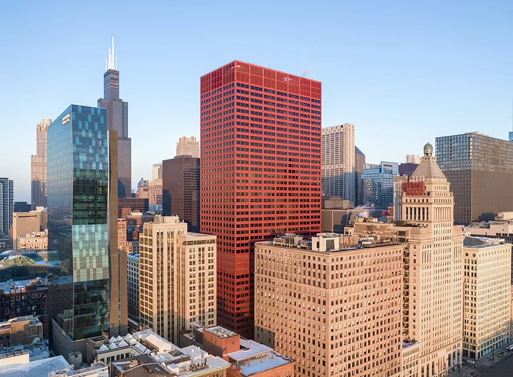
The First Chicago School of the 1880s and 1890s, led by Daniel Burnham, John Root, Louis Sullivan, Dankmar Adler, and William Holabird, treated the frame as the basis of design. The 1893 World’s Columbian Exposition then promoted Beaux-Arts classicism, and Burnham’s 1909 Plan of Chicago shaped the lakefront and street network. Frank Lloyd Wright developed the Prairie School in the city and its suburbs. In the 1920s, Art Deco and Gothic Revival towers stepped back from the street to meet zoning rules.
After 1938, Ludwig Mies van der Rohe arrived at the Armour Institute (now IIT) and defined a steel-and-glass modernism. Skidmore, Owings & Merrill (SOM), with engineer Fazlur Khan, developed tube structures for supertall towers. Bertrand Goldberg built sculptural concrete forms. Postmodernists such as Helmut Jahn and Thomas Beeby followed, and Jeanne Gang’s Studio Gang leads the current generation.
1. Willis Tower
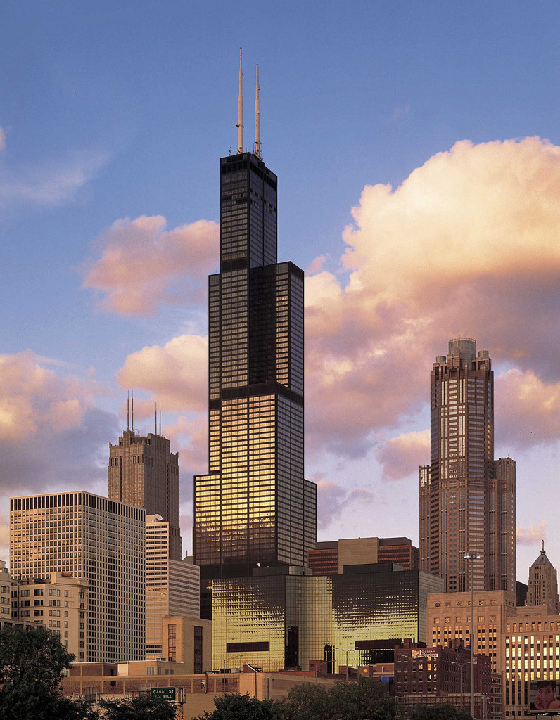
Willis Tower opened in 1973 as the Sears Tower. Skidmore, Owings & Merrill designed it, with architect Bruce Graham leading the design and engineer Fazlur Khan developing the structure. It has 110 stories and reaches 1,451 feet to the roof. It was the world’s tallest building from 1974 until 1998. The structure is a bundled tube: nine square tubes. The tubes end at different heights.
Two stop at the 50th floor, two at the 66th, and three at the 90th, and two continue to the 110th. This arrangement reduces wind loads and creates the stepped profile. Because the tubes carry the lateral forces, the floor plates stay open inside, giving about 4.5 million square feet of usable space.
The exterior uses black anodized aluminum and bronze-tinted glass. Black-painted steel columns and trusses appear at the plaza and lobby levels, which keeps the structural logic visible at street level. Visitors can reach the Skydeck on the 103rd floor. Glass boxes called The Ledge extend about four feet from the facade. The building was renamed Willis Tower in 2009, and the Skydeck was renovated in 2019. Willis Tower remains a reference point for tube-structure design and for anyone studying how structural systems shape tall-building form.
2. 875 North Michigan Avenue (formerly John Hancock Center)
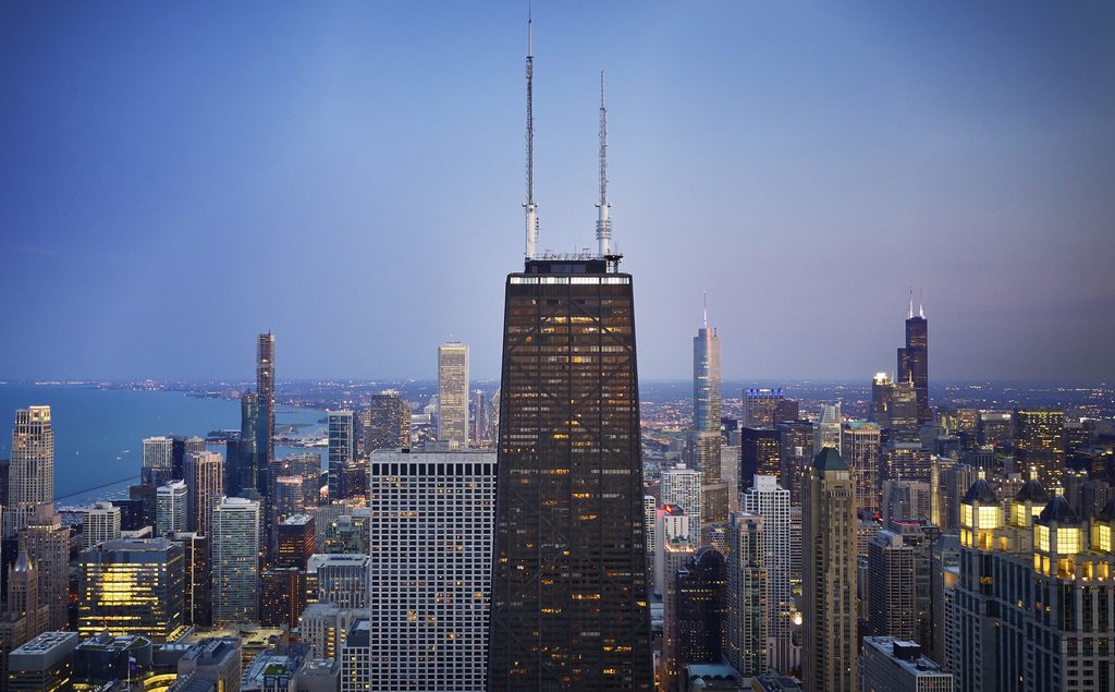
Completed in 1969, 875 North Michigan Avenue was designed by SOM, with Bruce Graham as design partner and Fazlur Khan as structural engineer. It has 100 stories, and the building was known as the John Hancock Center until it took its current address as its name in 2018. The tower is a trussed tube. Large diagonal steel X-braces on the facade work with the columns and floor beams to resist wind, so the exterior skin acts as the primary structure. The taper at the base reduces wind exposure and matches the floor plate to the uses inside.
Khan’s system used far less steel per square foot than earlier skyscrapers such as the Empire State Building, which made it an efficiency benchmark. The design is also an early large-scale mixed-use tower. Retail and parking occupy the lower floors, offices sit in the middle, and residences fill the upper levels. An observatory is on the 94th floor. The black-painted steel frame and bronze-tinted glass give the tower a clear, expressive structure. The braces cross the windows of the apartments inside, and designers have long cited that trade-off as the cost and reward of an exposed structural system.
3. Aqua Tower
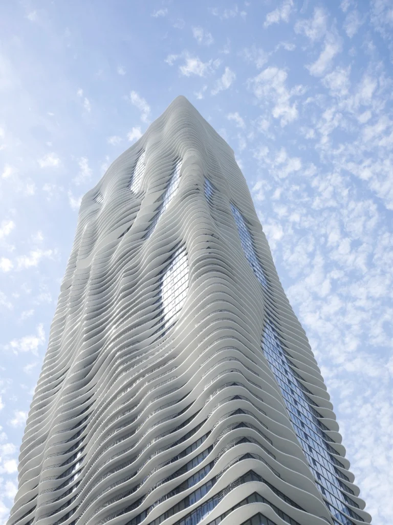
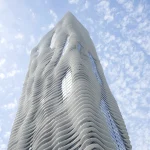
Aqua Tower, completed in 2009, is a mixed-use high-rise by Studio Gang, led by Jeanne Gang. It has 82 stories and stands 859 feet tall. It contains a hotel, apartments, condominiums, offices, and parking, and it was one of the tallest buildings in the world designed by a firm led by a woman when it opened. The defining feature is the facade. Each floor slab has a different outline, and the concrete balconies extend up to 12 feet beyond the glass. Seen from a distance, the edges form rippling, topographic contours. The shapes are the result of design logic as well as appearance.
The balcony variations disrupt wind flow along the facade and reduce the vortices that cause swaying in tall towers. They also give views of the skyline and the lake that change from floor to floor. The tower uses a conventional reinforced concrete structure, which keeps construction costs in line with a typical high-rise. The variation comes from cutting and forming each slab edge to a different profile. Glass on the window walls is tinted to reduce solar gain, and the balconies add shading to the floors below. A green roof on the podium and a public-facing base connect the tower to the street.
4. Marina City
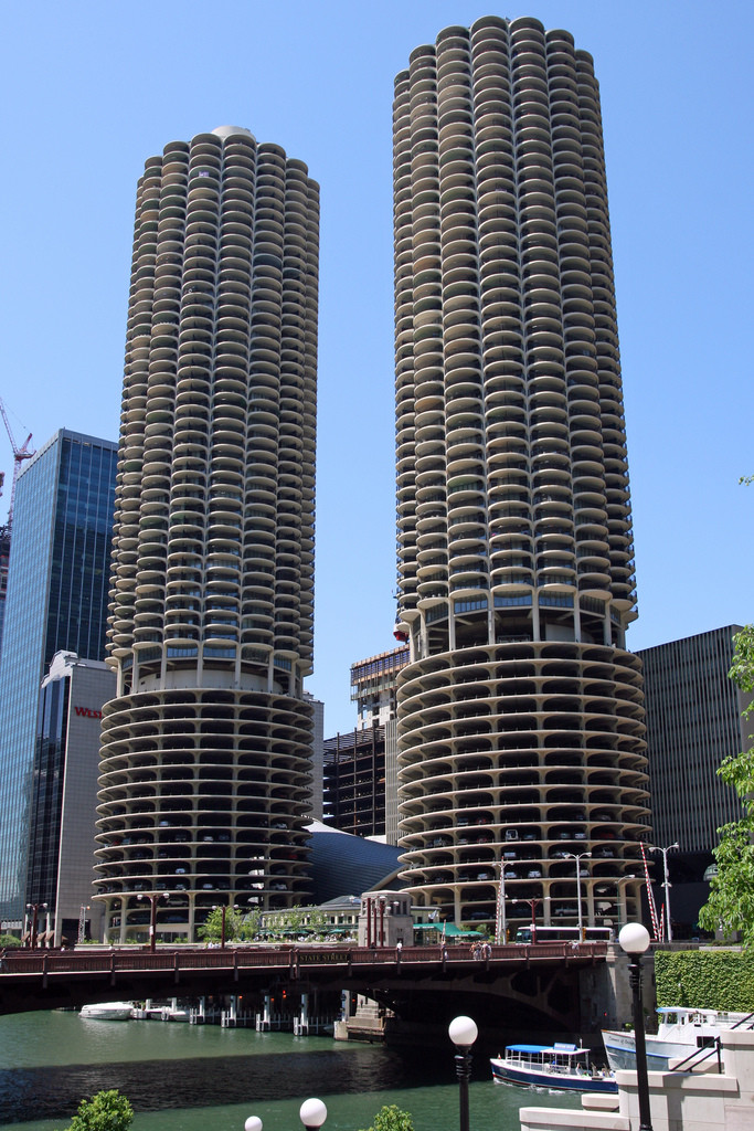
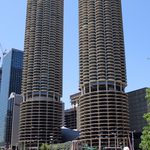
Marina City was designed by Bertrand Goldberg and built between 1959 and 1964. Its two circular towers have 65 stories each. Goldberg conceived it as a city within a city, with housing, shops, a theater, a marina, a bowling alley, and an ice rink, to draw middle-class residents back to the downtown area as families were moving to the suburbs. The towers are cast-in-place concrete.
A central core about 32 feet in diameter carries the building and holds elevators, stairs, and utilities. Apartments radiate from the core in wedge-shaped units, and each unit ends in a curved balcony. The balconies form the petal-like outline that earned the nickname “corncobs.”
The lower 19 floors are a spiral parking ramp, one of the first such uses of a vertical garage in a residential tower, with a car parked near the apartment level above. The curved geometry reduces wind loads and avoids corridors, since each floor plan is a pie slice served from the center. The balconies extend the living area outdoors and give each unit river or city views. Goldberg also designed the building to be built with repetitive formwork, which kept construction efficient. Marina City was designated a Chicago landmark in 2003 and now includes apartments and a hotel.
5. Tribune Tower
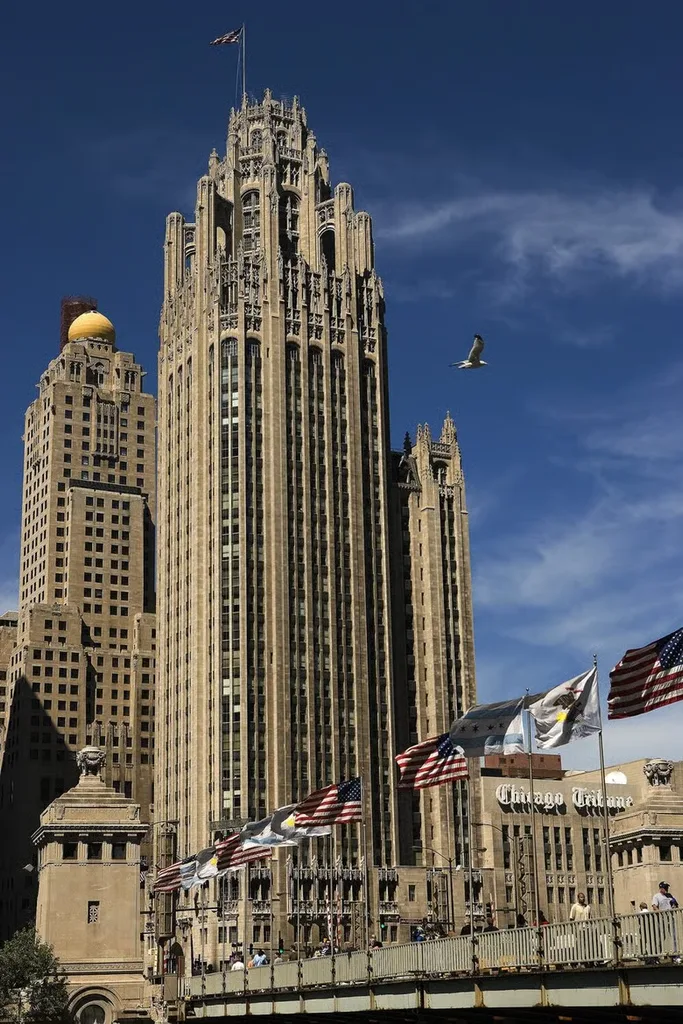
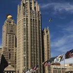
Tribune Tower was completed in 1925 for the Chicago Tribune. The design came from a 1922 international competition that drew 260 entries. Raymond Hood and John Mead Howells won with a Gothic Revival scheme. Other entries included Walter Gropius and Adolf Meyer’s modernist proposal, Eliel Saarinen’s second-place design, and Adolf Loos’s tower shaped like a giant Doric column.
Saarinen’s design influenced American skyscrapers for years. The structure is a steel frame clad in Indiana limestone. Piers rise in vertical lines and end in a crown of flying buttresses, which give the top an open, lantern-like profile and also conceal mechanical equipment. The Gothic detail ties the tower to the tradition of medieval cathedrals while serving a modern skyscraper plan.
A collection of stones from historic sites is set into the lower walls. Reporters sent them from places such as the Great Pyramid, the Parthenon, the Taj Mahal, Notre-Dame de Paris, and the Berlin Wall, and a piece from the moon is included. The practice began under Colonel Robert McCormick, the Tribune’s publisher. The tower anchors the northern end of the Michigan Avenue Bridge area. In 2018, the building was converted into condominiums and is now known as Tribune Tower Residences, which kept the exterior while changing interior use.
6. Wrigley Building
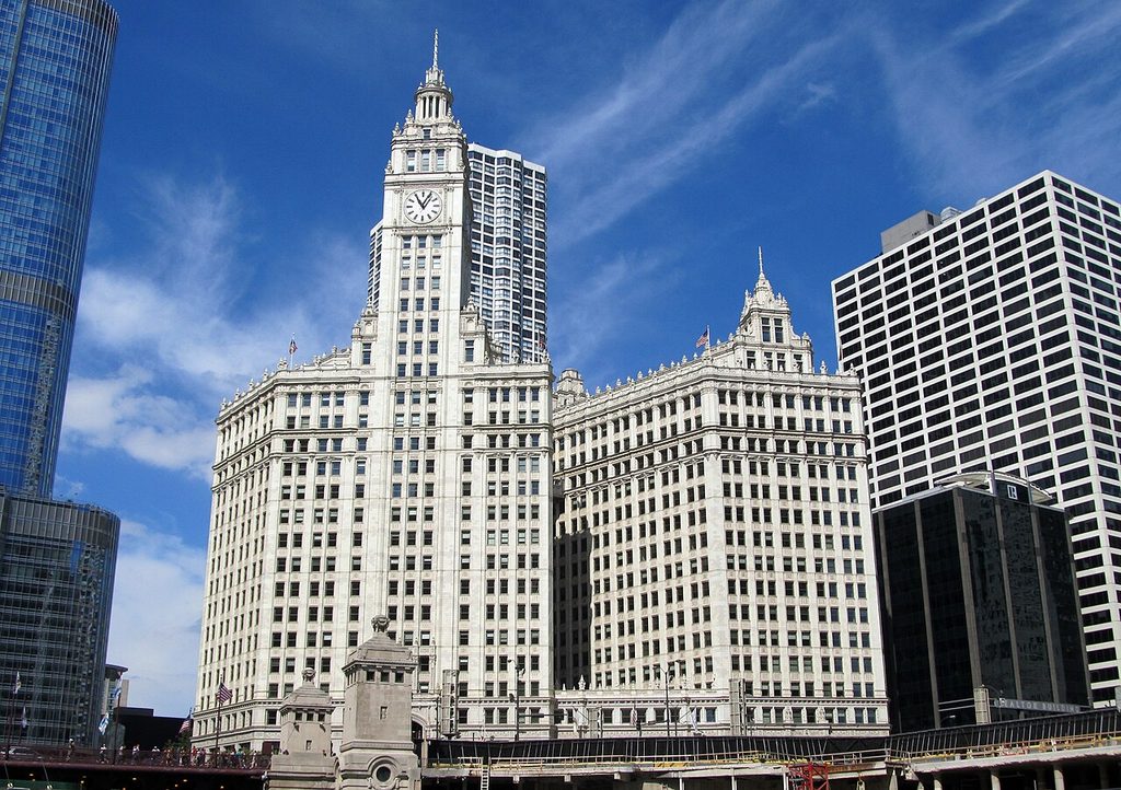
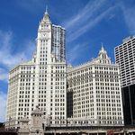
The Wrigley Building consists of two towers, completed in 1921 (south) and 1924 (north), designed by Graham, Anderson, Probst and White for the chewing gum company of William Wrigley Jr. It sits at the north end of the Michigan Avenue Bridge, facing the Tribune Tower across the street. The design draws on the Giralda in Seville, and French Renaissance details appear on the building’s crown and ornament. The tower has a clock with 19-foot-diameter faces. The facade is clad in glazed terra cotta in several white and cream shades, selected to look clean in a smoky city.
The glazing sheds soot, which makes the material suited to the Chicago climate. Because the shades vary, the surface appears to change color through the day. A pedestrian bridge at the 14th-floor level links the two towers, and an open plaza connects them at street level. The Wrigley Building was the first major building in Chicago to be lit by floodlights, which made it a nighttime landmark and a model for lighting architecture. The structure is a steel frame, typical of the period, and the building layout provides high-quality office space with abundant daylight. It was designated a Chicago landmark in 1977.
7. The Rookery Building
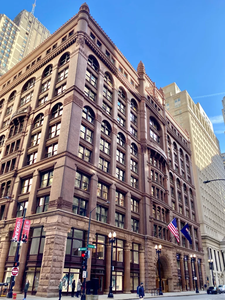
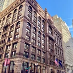
The Rookery was completed in 1888 and designed by Burnham and Root. The name refers to the pigeons and crows that gathered near the temporary city hall that stood on the site earlier. The building combines two structural systems. The exterior walls are load-bearing masonry, and the interior uses an iron and steel frame. This hybrid method was typical of the transition years before the full steel skeleton.
John Root addressed Chicago’s soft soil with a floating raft foundation made of steel rails set in concrete, which spreads the load across a wide area. The exterior is red brick, terra cotta, and granite in a Romanesque Revival style, with Byzantine and Moorish touches.
The main design element is a two-story interior light court. Glass and iron enclose it, and a floating, cantilevered oriel staircase rises through it. The court brings daylight into the center of the building, which was important before reliable electric lighting. In 1905, Frank Lloyd Wright renovated the lobby for the building’s owner. He added white marble, gold-leaf geometric ornament, and new light fixtures, which simplified Root’s detailing. In the 1990s, Wright’s work was restored. The Rookery is also a National Historic Landmark and still serves as an office building.
8. Robie House
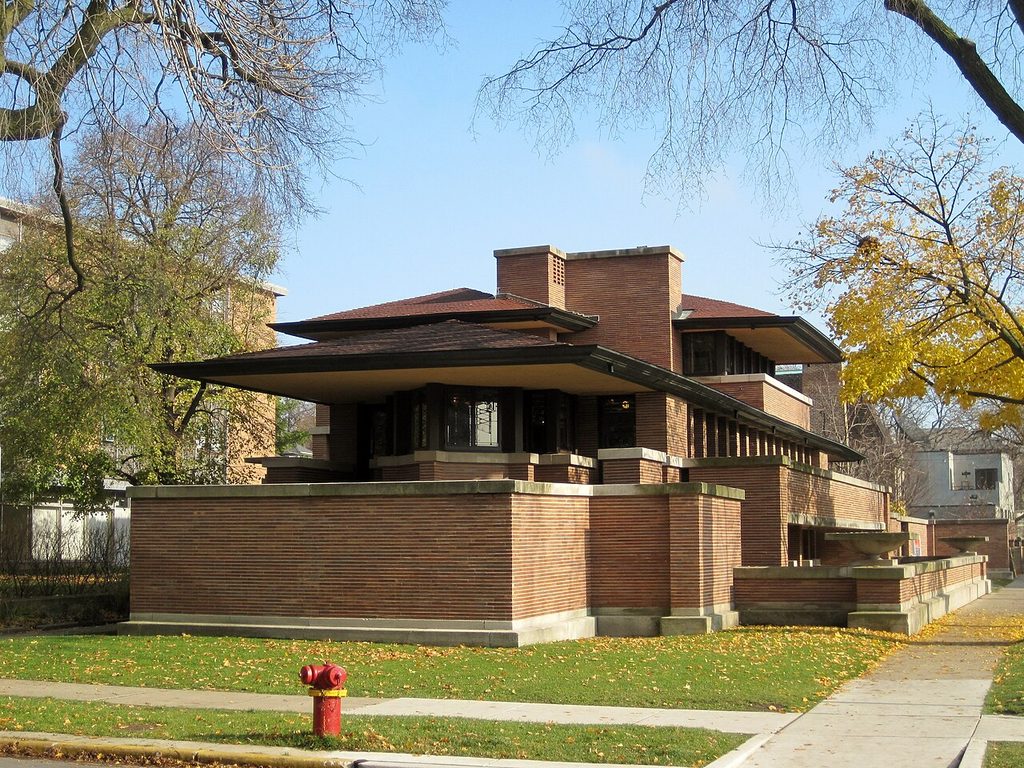
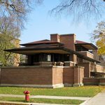
The Robie House, built in 1909 and 1910, is Frank Lloyd Wright’s best-known Prairie School design. It stands on the University of Chicago campus in Hyde Park, and Wright designed it for businessman Frederick C. Robie. The house is defined by horizontal lines. Long, thin Roman bricks and tinted mortar joints stress the horizontal, and limestone sills and coping strengthen the lines.
The roofs have deep overhangs, and the main roof cantilevers about 20 feet. Hidden steel beams carry the cantilever. The shapes were meant to echo the flat Midwestern landscape. Inside, Wright used an open plan. The living and dining areas flow as one space, divided by a central fireplace.
Rooms are grouped around this core, and the second-floor living space opens to the street through a continuous band of art-glass windows and doors. The patterned glass admits light while keeping privacy from the street. Wright also designed built-in furniture, light fixtures, and rugs, treating the house as one complete work. The layout puts the main living rooms above the ground, which gives a view of the garden and balconies while limiting street noise. The house is owned by the University of Chicago and managed by the Frank Lloyd Wright Trust. In 2019, UNESCO listed it among eight Wright buildings as a World Heritage Site.
9. Chicago Board of Trade Building
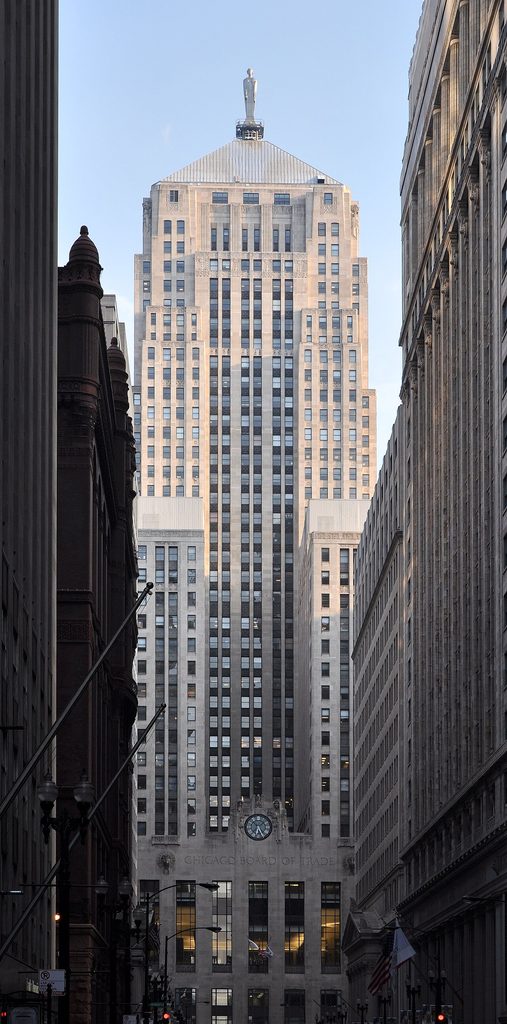
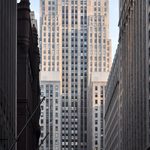
The Chicago Board of Trade Building opened in 1930. Holabird & Root designed it in the Art Deco style. It was the tallest building in Chicago until 1965. It stands at the south end of LaSalle Street, where the street ends at the building, so the tower closes the view down the financial district’s main corridor. The massing follows the city’s zoning rules, with setbacks as the building rises. Above the setbacks, a pyramidal roof carries a 31-foot aluminum statue of Ceres, the Roman goddess of grain, by sculptor John Storrs. The figure has no face, a choice that suits the stylized, abstract language of Art Deco.
The grain reference ties to the exchange’s business, which centered on agricultural futures. The facade is Indiana limestone with strong vertical piers. Inside, the lobby has patterned marble and metalwork with Art Deco geometry. The original trading floor was a large column-free hall, and it was one of the largest in the country. In 1982, Helmut Jahn designed an addition at the rear. It is a postmodern glass atrium and tower that returns the Art Deco forms in a different language, creating a dialogue between two eras on one site.
10. Carbide & Carbon Building
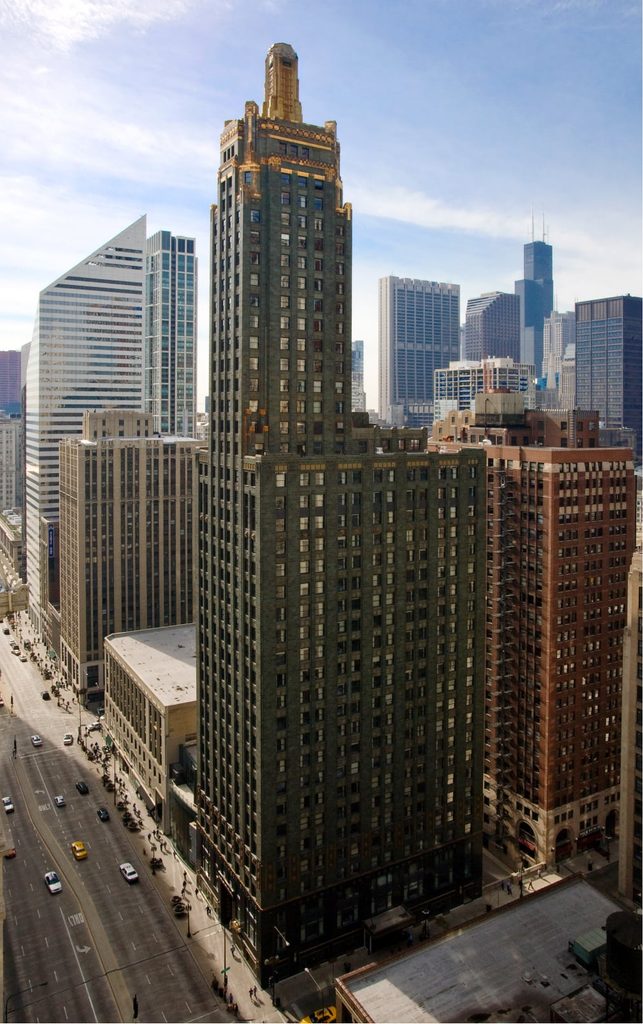
The Carbide & Carbon Building was completed in 1929 and designed by Burnham Brothers, the firm of Daniel Burnham’s sons, Daniel Jr. and Hubert. It is one of the best-known Art Deco towers in the United States and stands on Michigan Avenue near the river.
The design is built around color and material. A base of polished black granite supports a shaft clad in dark green terra cotta. The top is trimmed in gold leaf, and the mix of green and gold makes the tower distinct among the pale limestone buildings nearby. The terra cotta carries stylized ornament in repeated geometric patterns, and the vertical piers draw the eye upward.
The tower is built with setbacks and ends in a slim, stepped crown. The building was developed for the Union Carbide and Carbon Corporation, and the dark and gold palette is often linked to the company’s colors. A popular story says the tower was meant to look like a champagne bottle. The architects did not confirm this, so it is better treated as local legend than as design history. The interior followed the Art Deco style, with metalwork, patterned marble, and decorative lighting. The structure is a steel frame, typical of the period. The building was later converted into a hotel.
11. Auditorium Building
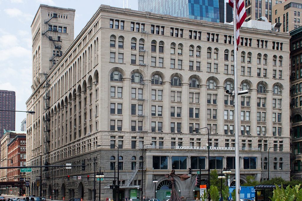
The Auditorium Building opened in 1889 and was designed by Adler & Sullivan. It combined a hotel, offices, and a theater of about 4,200 seats in one block. Developer Ferdinand Peck wanted a venue that would bring opera and civic events to a wide audience at affordable prices. Frank Lloyd Wright worked in the firm’s drafting room during the project as a young draftsman.
The exterior is Richardsonian Romanesque, a style named for H. H. Richardson. Heavy granite and limestone walls, deep arches, and a 270-foot tower give the building a fortress-like presence. The structure is load-bearing masonry on a raft foundation, and the building is so heavy that it has settled several inches over the years.
The theater is the main attraction. Adler designed the acoustics, and the hall has a series of arched, elliptical bands over the ceiling that direct sound toward the seats, so even the upper balcony hears clearly. Sullivan’s stencil work, gold-leaf plaster ornament, and electric lights in the ceiling arches created an intimate feeling in a large space. It was among the first buildings to use electric lighting this extensively. Roosevelt University has occupied the building since 1947, and the Auditorium Theatre was restored in the 1960s.
12. Monadnock Building
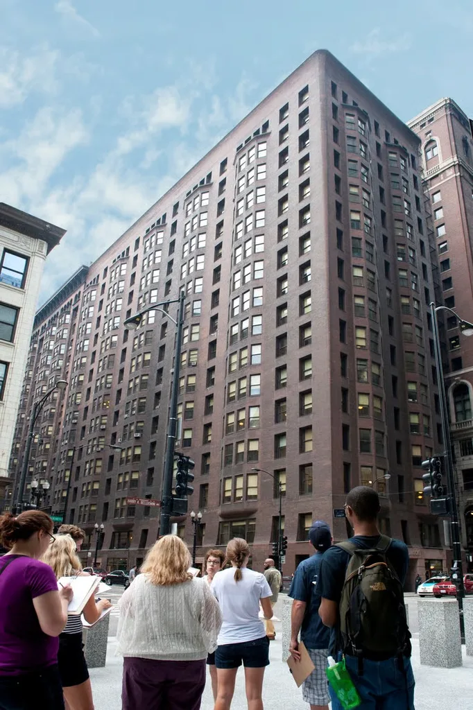
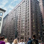
The Monadnock Building was built in two parts. The north half, by Burnham & Root, was finished in 1891. The south half, by Holabird & Roche, followed in 1893. At 16 stories, it is the tallest load-bearing masonry building in the city and a final example of the technique. To carry the weight, the walls are six feet thick at the base.
The brick is brown, and the facade has no applied ornament, an approach John Root adopted after the client asked for a plain building to keep costs down. The wall rises in a gentle curve and flares outward at the base and the cornice, a shape that recalls Egyptian forms and gives the facade a sculptural quality without decoration.
Bay windows project in a rhythmic pattern to bring in light and create shadow lines. The south half used a different system. Holabird & Roche used a steel frame with terra cotta cladding, which allowed thinner walls and more usable floor area. Standing side by side in one building, the two halves show the shift from masonry to steel in only two years. The interior has long, narrow corridors lined with marble and cast-iron staircases. The building has continued to settle slightly because of the soft ground.
13. 860–880 Lake Shore Drive Apartments
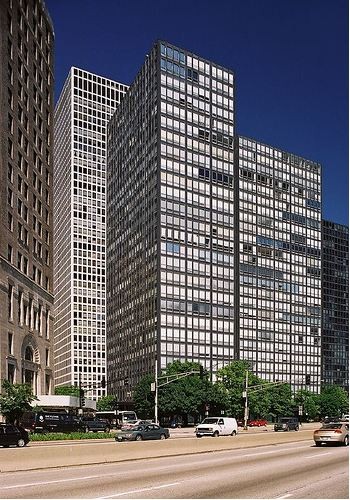
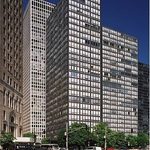
The two apartment towers at 860–880 Lake Shore Drive were designed by Ludwig Mies van der Rohe and built between 1949 and 1951. Each tower has 26 stories. Developer Herbert Greenwald commissioned them, and they became the model for the glass-box high-rise worldwide. They are National Historic Landmarks. The structure is a steel frame, and the facade is a curtain wall of glass and steel. Because building codes required steel to be fireproofed with concrete, the frame is encased, which hides the actual structure. Mies resolved this by welding steel I-beams to the outside of the facade as mullions. These beams carry no load.
The towers are set at right angles to each other, which gives each building clear views and breaks up the street wall. The ground floor is open, with a recessed glass lobby behind slender columns, and a plaza surrounds the buildings. The layout is simple, with a regular bay grid and open floor plans that let owners arrange rooms freely. Materials are limited to steel painted black, glass, and a small amount of travertine in the lobbies.
The design uses proportion and detail in place of ornament. The tower shaped corporate and residential architecture for decades, and many later glass buildings derive from this one. Architects still study it for its discipline of detail and its clear structural grid.
14. Chicago Cultural Center
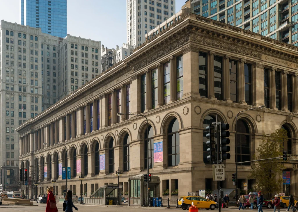
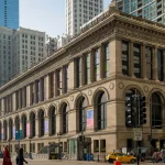
The Chicago Cultural Center opened in 1897 as the city’s first central public library. Shepley, Rutan and Coolidge designed it in the Beaux-Arts and Neoclassical styles. The building also served as a memorial hall for Civil War veterans and now houses free exhibitions, concerts, and events. It stands on Michigan Avenue across from Millennium Park.
The facade is limestone with Greek and Roman references, including columns, pediments, and a monumental entrance. The interior is the main draw. The north dome, in Preston Bradley Hall, is a Tiffany stained-glass dome 38 feet in diameter. It contains about 30,000 pieces of glass and is widely described as the largest Tiffany dome in the world.
Its design uses a pattern of zodiac signs and a ribbed form that lets daylight filter into the hall below. Materials include Carrara marble staircases, mother-of-pearl and glass mosaics, and carved quotations from authors and thinkers set into the walls. The south dome, in the Grand Army of the Republic Rotunda, is a different design, with a Renaissance-style glass dome with a flat stained-glass ceiling. The library moved to the Harold Washington Library Center in 1991, and the building was converted into a cultural venue. It keeps its original finishes and is a clear example of how civic buildings in the 1890s used rich materials to express public ambition.
15. The Merchandise Mart
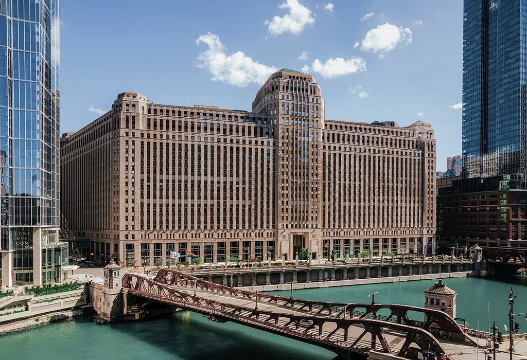
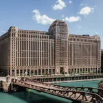
The Merchandise Mart opened in 1930 for Marshall Field & Company. Graham, Anderson, Probst & White designed it in the Art Deco style. It has about 4.2 million square feet of floor area, and it was the largest building in the world by floor area until the Pentagon was finished in 1943. It occupies two city blocks on the north bank of the Chicago River.
The building was meant to bring wholesale merchants and manufacturers under one roof. The base is 18 stories. Rail lines once ran under the building so goods could be delivered directly. The facade is limestone over a steel frame, with a regular grid of windows and a restrained, stepped silhouette.
The scale gives the facade a strong horizontal presence on the river. The Kennedy family bought the building in 1945, and it kept its function as a design and commercial center. In the lobby, a Hall of Fame displays busts of leading figures in retail history, including Marshall Field, Julius Rosenwald, and others. A projection installation called Art on theMART has run on the river facade since 2018. It uses the building’s large flat surface as a screen for digital art, which gives the Art Deco building a new function without changing the structure.
16. Sullivan Center (formerly Carson Pirie Scott Building)
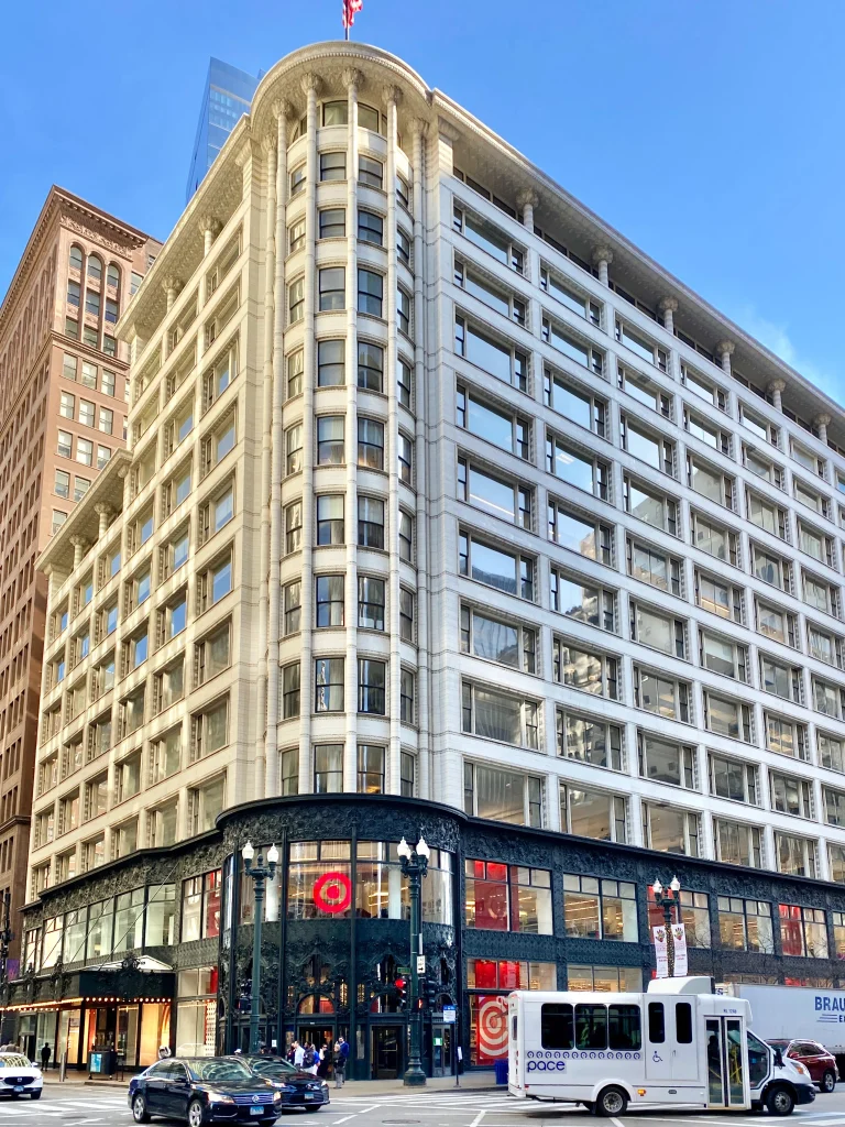
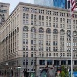
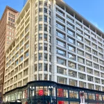
The Sullivan Center was designed by Louis Sullivan for the Schlesinger & Mayer department store. The first section opened in 1899 and was extended in 1903 and 1904. Daniel Burnham’s firm added a further section in 1906. It was long known as the Carson Pirie Scott Building and is now called the Sullivan Center. The upper floors have a white terra cotta grid that expresses the steel frame behind it.
The windows are Chicago windows, each with a large fixed central pane flanked by narrower operable sashes. This arrangement admits as much daylight as possible, which helped sell merchandise. The upper facade has little ornament, so the structure reads clearly.
The base is the opposite. The first two floors are covered in elaborate cast-iron ornament, with dense botanical forms in a design by Sullivan and his draftsman George Elmslie. The decoration frames the display windows and focuses attention on the entrance. A rounded corner bay at State and Madison marks the main entry and holds a tall, ornamented doorway. The contrast between the plain grid above and the rich base below shows Sullivan’s principle that form follows function, with ornament used to mark the public part of the building. A restoration led by architect John Vinci was completed in 2006.
17. Harold Washington Library Center
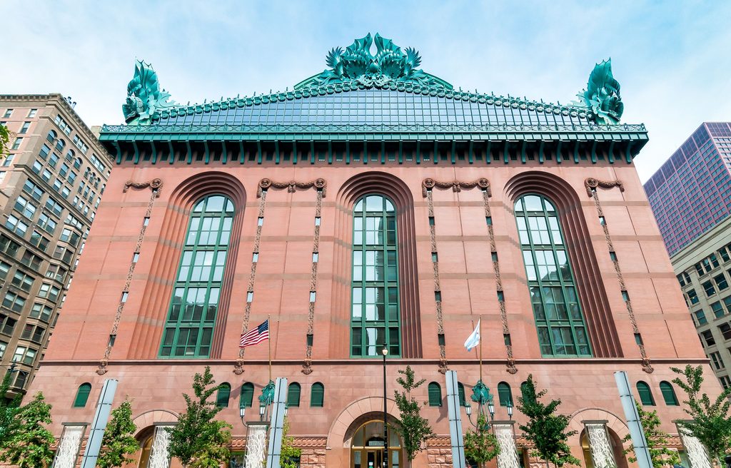
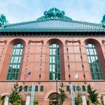
The Harold Washington Library Center opened in 1991 and replaced the old central library at what is now the Cultural Center. Thomas Beeby of Hammond Beeby & Babka won the design competition. The building is named for Chicago’s first Black mayor, Harold Washington, and it was the largest public library building in the world when it opened, with about 756,000 square feet. The design is postmodern and draws on the city’s older buildings. The base is granite, and the upper floors are red brick with arched windows, a combination that echoes the Rookery, the Auditorium Building, and other late nineteenth-century Chicago structures.
The large scale and strong lines also recall the Beaux-Arts tradition of civic monuments, and the building fills a full city block. At the roofline, large aluminum ornaments called acroteria mark the corners. They include owls, which stand for wisdom, along with agricultural motifs that point to the Midwest. These details make the library recognizable from a distance and give the heavy masonry a lighter crown. The interior is organized around a central circulation system with reading rooms, a large auditorium, and exhibition spaces. A glass-roofed Winter Garden on the top floor brings daylight into a public room.
18. St. Regis Chicago (formerly Vista Tower)
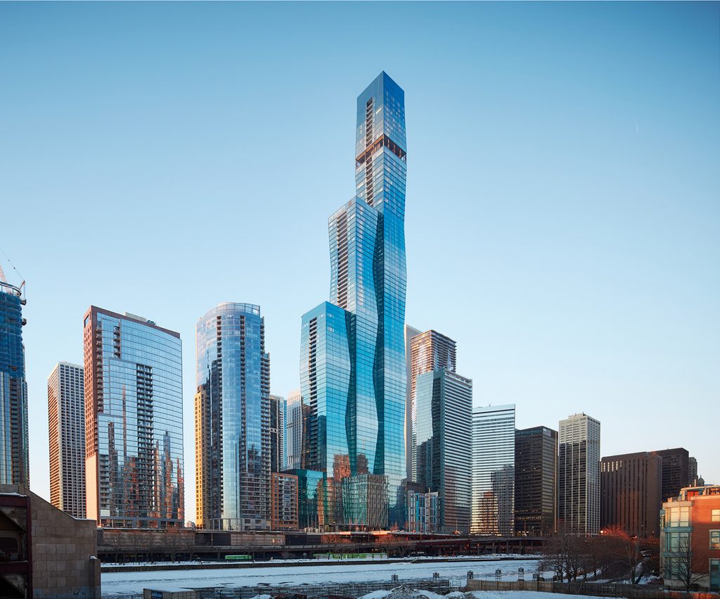
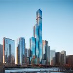
St. Regis Chicago was completed in 2020 and designed by Studio Gang, led by Jeanne Gang. It stands at 363 East Wacker Drive, on the river near the lake, and has 101 stories. It is the third-tallest building in Chicago. It was named Vista Tower during development and contains a hotel and condominiums. The tower is formed from three interlocking, tapering shafts of different heights.
They rise from a shared base and step back as they climb, which breaks the mass into slender parts. The three heights create a stepped skyline profile and bring daylight and views to each unit. The sloped sections also reduce the apparent bulk from the ground.
The facade is a glass curtain wall with a faceted surface. Folded glass panels catch light at different angles, so the surface appears to change through the day and with the weather. This follows the approach Gang used in Aqua Tower, where the facade shape responds to wind and views. The shifted shafts also help to disrupt wind flow, which lowers movement at the top of the tower. At the base, the design connects to the Chicago Riverwalk and the public realm, with an entrance, a hotel lobby, and amenity levels set among the podium floors.
19. Chicago Water Tower
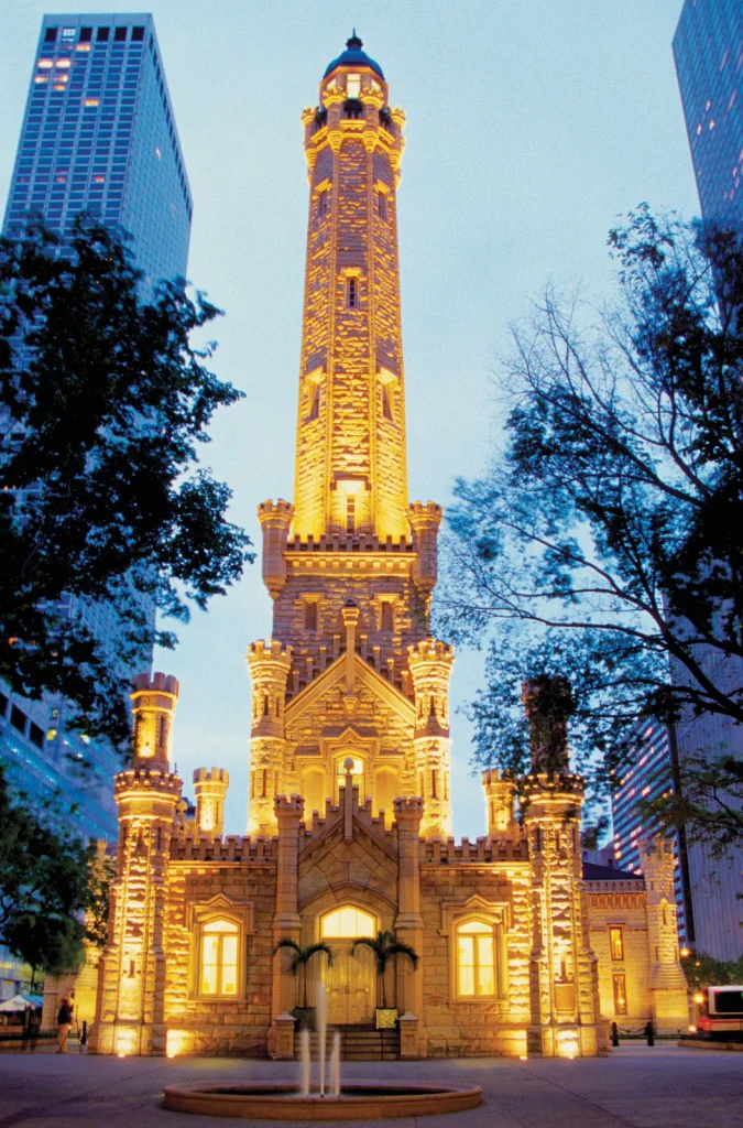
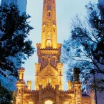
The Chicago Water Tower was built in 1869 and designed by William W. Boyington. It is a Gothic Revival structure of Lemont limestone with castle-like turrets and crenellations. It stands about 154 feet tall on Michigan Avenue. The tower was built as a decorative housing for a standpipe, a vertical pipe that regulated water pressure in the city’s supply system, which was designed by engineer Ellis Chesbrough.
The tower is best known as one of the few downtown buildings to survive the Great Fire of 1871. It stood at the edge of the burned area, and its limestone walls resisted the flames. After the fire, it became a symbol of the city’s resilience.
The design is a slim octagonal-based tower with pointed arches, corner turrets, and a tall central shaft that hides the iron standpipe. Boyington also designed the matching pumping station across the street. The two buildings form a pair in the same limestone and Gothic style. The standpipe was taken out of service in the early twentieth century, and the tower has since been used as a city gallery and visitor space. The surrounding streets later filled with high-rise buildings, so the small, heavy tower now contrasts with the glass towers near it, which makes its scale and material stand out.
20. McCormick Tribune Campus Center

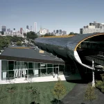
The McCormick Tribune Campus Center is a student center at the Illinois Institute of Technology (IIT), designed by Rem Koolhaas and the Office for Metropolitan Architecture (OMA) and completed in 2003. It stands on the campus planned by Ludwig Mies van der Rohe, whose steel-and-glass buildings surround it, including Crown Hall.
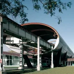
The site was a difficult one. The Chicago Transit Authority’s elevated Green Line tracks run across the campus, and noise from trains was a constant problem. Koolhaas built the center directly beneath the tracks. A stainless-steel tube wraps the track structure and dampens sound, so the trains pass above while the interior stays usable.
The tube is a functional piece of acoustic design and also a distinctive form on the campus. The building is mostly one story and covers about 110,000 square feet. It follows Mies’s low, flat campus profile, and it avoids competing with the surrounding buildings. Inside, the plan is a single large open space with a mix of uses, including a food court, a bookstore, a lounge, and meeting rooms. Circulation paths run in many directions through the room, so students move across the building and meet along the way. The design also incorporates a ceiling of colored panels and large graphic wall treatments that add a looser character to the Miesian setting.
Chicago’s buildings are easier to understand when grouped by area. A walk through the Loop covers most of the early steel-frame and Art Deco work in a few hours. The river corridor is a separate route, and a few buildings need their own trips.