


On June 25, 2026, Robert Venturi would have turned 101. Few architects challenged the conventions of twentieth-century architecture as directly as he did. At a time when Modernism favored minimal ornamentation, Venturi argued for complexity, contradiction, and symbolism.
His ideas were outlined in Complexity and Contradiction in Architecture (1966) and later expanded in Learning from Las Vegas (1972), co-authored with Denise Scott Brown and Steven Izenour. He is also remembered for the phrase “Less is a bore,” a direct response to Mies van der Rohe’s modernist principle of “Less is more.” Venturi applied them across a diverse body of work: from houses and university buildings to museums, visitor centers, and civic projects.
These 12 projects highlight Venturi’s work and demonstrate why they continue to be studied decades after they were built.
1. Vanna Venturi House (1964, Philadelphia, USA)

Designed for his mother, Vanna Venturi House is one of Robert Venturi’s earliest and most influential projects. Completed in 1964, the house became a built expression of ideas that would later be formalized in Complexity and Contradiction in Architecture, challenging the simplicity that characterized much of modernist residential design.

The house adopts familiar elements associated with traditional domestic architecture, including a pitched roof, central chimney, and symmetrical front facade. However, these features are deliberately manipulated: the chimney is positioned off-center, windows vary in size and placement, and the large gable facade conceals a more complex arrangement behind it. As a result, the building appears conventional at first glance but reveals much more on closer inspection. Internally, the plan departs from the open layouts favored by many modernist houses of the period.
Spaces are organized around a central hearth, while changes in scale, ceiling heights, and circulation create a varied spatial experience within a relatively compact footprint.
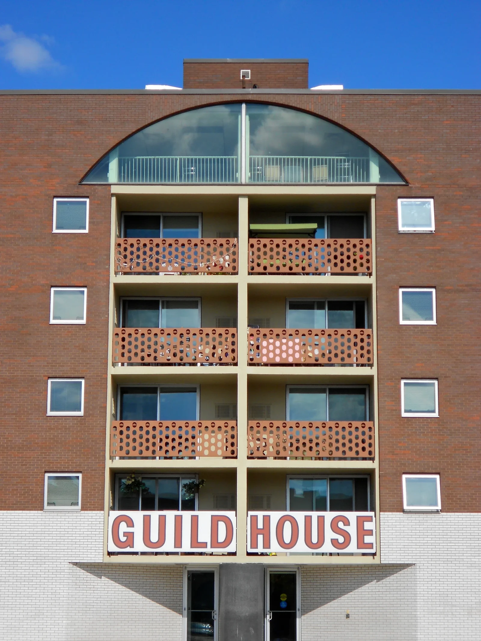
2. Guild House (1963, Philadelphia, USA)

Guild House was designed as affordable housing for elderly residents in Philadelphia. At a time when many architects were exploring new materials and expressive structural forms, Robert Venturi took a different approach, focusing on familiarity, context, and the everyday needs of the building’s users.

The six-story building is constructed primarily from red brick, a common material in the surrounding neighborhood. Its facade is organized with a symmetrical composition, regularly spaced windows, and a clearly defined entrance. Venturi used subtle architectural elements to give the building its identity, including an oversized entrance arch and decorative detailing that distinguishes it from typical apartment blocks. One of the project’s most recognized features is the large television antenna mounted on the roof.
While not a functional necessity, it was included as a symbolic element acknowledging the importance of television in the daily lives of many residents. This decision reflected Venturi’s interest in incorporating aspects of ordinary culture into architectural design.
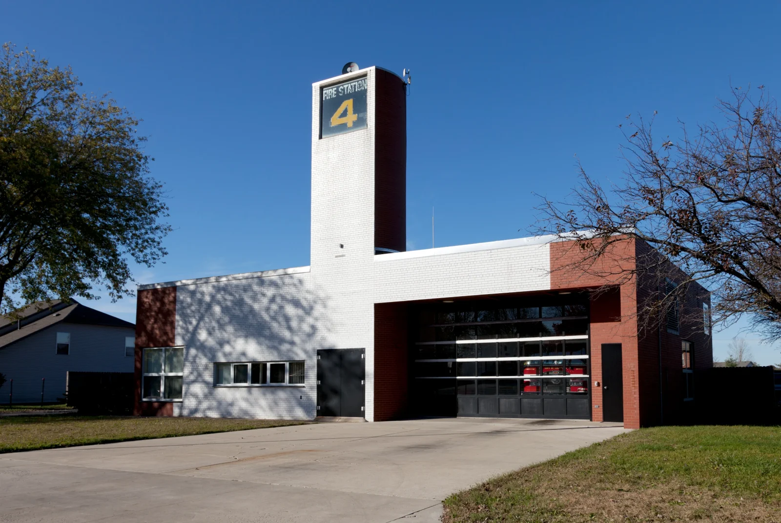
3. Fire Station No. 4 (1968, Columbus, Indiana, USA)

Fire Station No. 4 was commissioned as part of Columbus, Indiana’s broader effort to elevate the quality of public architecture through collaborations with leading architects. Designed by Robert Venturi, the project challenged the prevailing notion that civic and service buildings should be purely functional in appearance.

The building is organized around the operational requirements of a working fire station, with apparatus bays, offices, and support spaces arranged in a compact plan. However, Venturi moved away from the exposed structural expression common in modernist public buildings. Instead, he used a flat front facade, applied ornament, and graphic elements to give the station a stronger civic presence. A prominent feature is the large decorative arch framing the garage doors. While the arch recalls historical architectural forms, it does not serve a structural function. The building also incorporates bold signage and color accents, making its purpose immediately recognizable from the street.
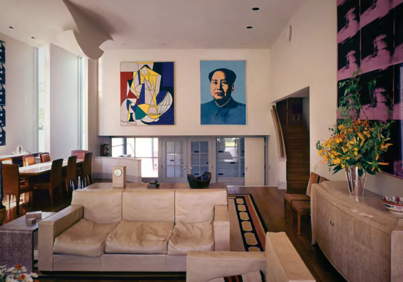
4. Brant House (1971, Greenwich, Connecticut, USA)

Designed for Richard and Suzanne Brant, the Brant House shows Robert Venturi’s interest in combining familiar residential forms with unconventional spatial arrangements. While the house references traditional domestic architecture through its pitched roofs, chimney, and symmetrical appearance, these elements are manipulated to create a more complex composition.

The design consists of intersecting volumes organized around a central living space. The house uses shifts in scale, varied roof forms, and facades to break down the building’s mass. This approach allowed Venturi to create visual complexity without abandoning recognizable architectural elements. The project also reflects his interest in historical references: instead of rejecting traditional forms, as many modernist architects did, Venturi reinterpreted them in a contemporary context.
Features such as the oversized gable, prominent chimney, and composed elevations draw from historical domestic architecture while avoiding direct imitation. Internally, the house balances formal rooms with more informal living spaces, responding to changing patterns of family life.
5. Franklin Court (1976, Philadelphia, USA)

Completed for the United States Bicentennial celebrations, Franklin Court was designed on the site of Benjamin Franklin’s former residence in Philadelphia. Since the original house had been demolished in the early nineteenth century, the project faced a unique challenge: how to interpret an important historic site without reconstructing a building for which complete documentation did not exist.

Instead of simply creating a replica, the architects developed what became known as the “ghost structure.” It was a full-scale steel framework that outlined the dimensions and form of Franklin’s original house. The structure marks the building’s former presence while making clear that it is a contemporary interpretation. The site also incorporates underground exhibition spaces, archaeological remains, visitor facilities, and interpretive displays that present Franklin’s life and work. Franklin Court reflects Venturi and Scott Brown’s interest in symbolism, communication, and historical interpretation. The project is also widely regarded as an influential example of heritage interpretation.
6. Gordon Wu Hall (1983, Princeton University, New Jersey, USA)

Completed in 1983 as a residential building for Princeton University, Gordon Wu Hall formed part of the university’s expansion of student housing. The project required Robert Venturi and Denise Scott Brown to respond to a campus known for its Collegiate Gothic architecture while accommodating contemporary residential needs.

The architects developed a design that acknowledged the campus context through scale, materials, and composition. The building uses brick facades, pitched roofs, towers, arches, and patterned openings that reference Princeton’s architectural character but arrange these elements in a contemporary manner. The residence is organized around communal spaces and circulation routes intended to encourage interaction among students. Its massing breaks the program into smaller volumes, reducing the building’s scale and helping it integrate with the surrounding campus fabric.
Changes in rooflines, window arrangements, and facade treatments create visual variety while reinforcing the building’s relationship to neighboring structures.
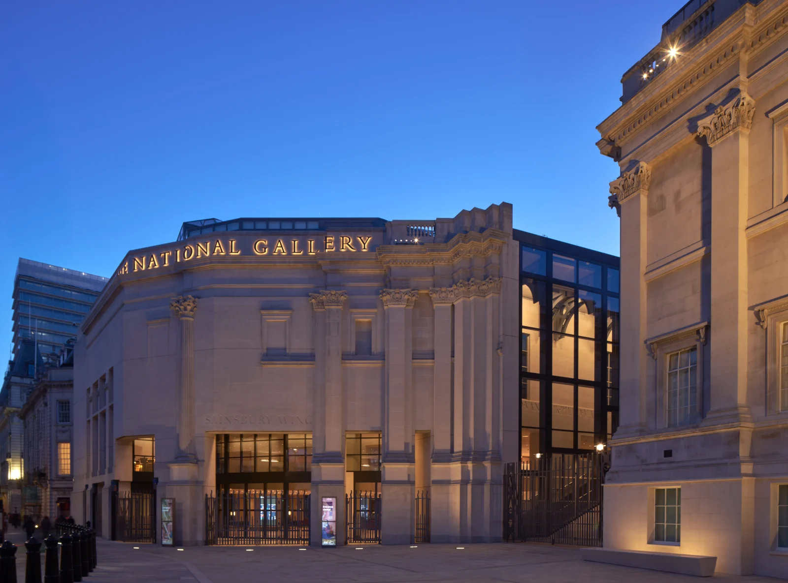
7. Sainsbury Wing (1991, National Gallery, London, UK)

The Sainsbury Wing was designed as an extension of the National Gallery in London, developed to house the museum’s collection of Early Renaissance paintings. The project occupied a highly sensitive site on Trafalgar Square, requiring a response to one of Britain’s most significant cultural institutions.

The architects designed the extension to relate closely to the National Gallery’s existing neoclassical architecture. The facade incorporates limestone cladding, pilasters, cornices, and proportioned openings that echo the language of the original building. However, these elements are simplified and combined in ways that distinguish the extension from a direct historical replica. Inside, the galleries were designed around the scale and viewing requirements of Renaissance artworks. A sequence of rooms, varied ceiling heights, and natural lighting create an environment that supports the collection while guiding visitors through the building. The circulation strategy also improves connections between the extension and the historic museum.
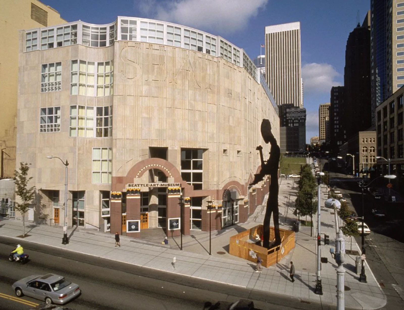
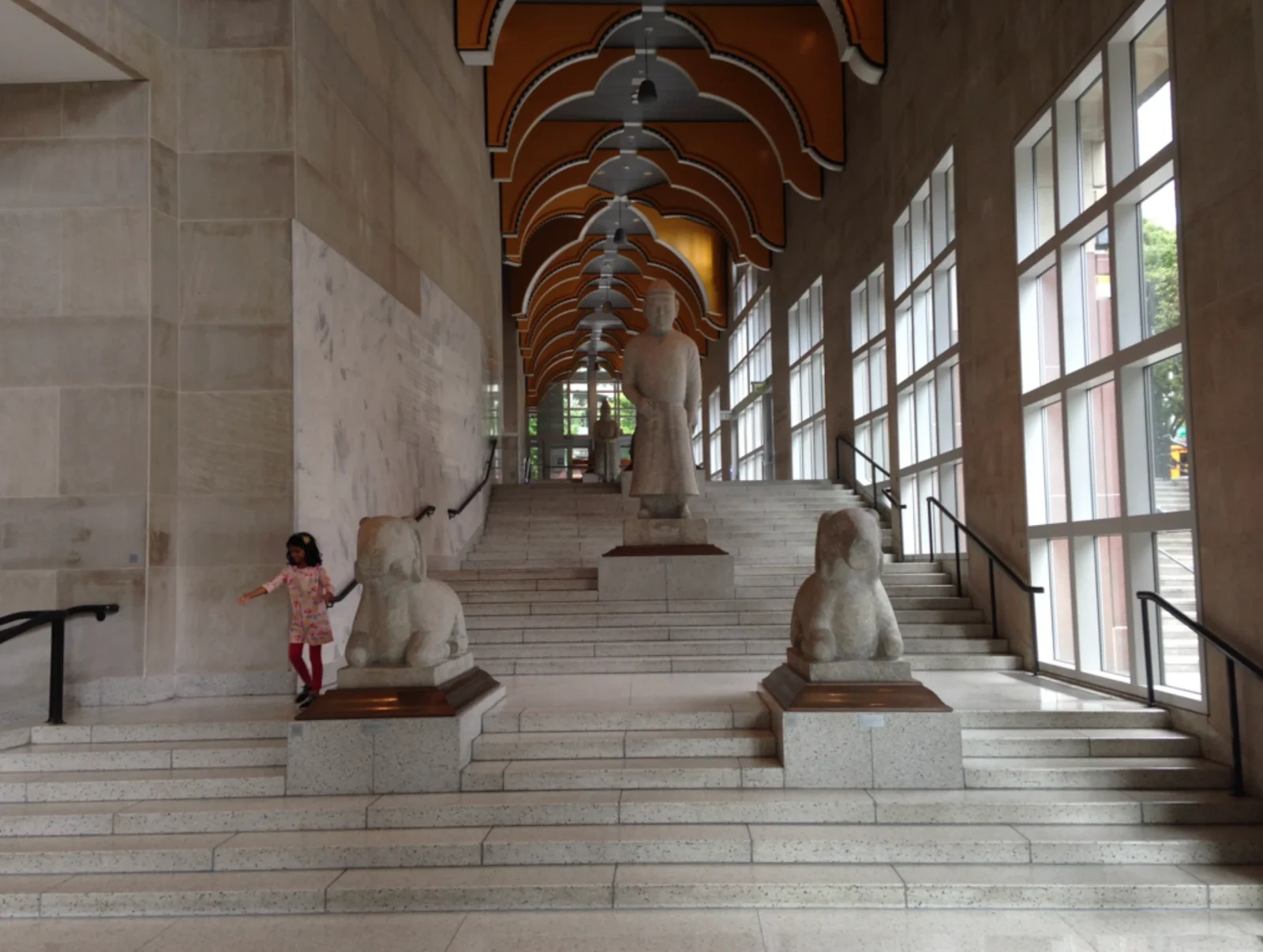
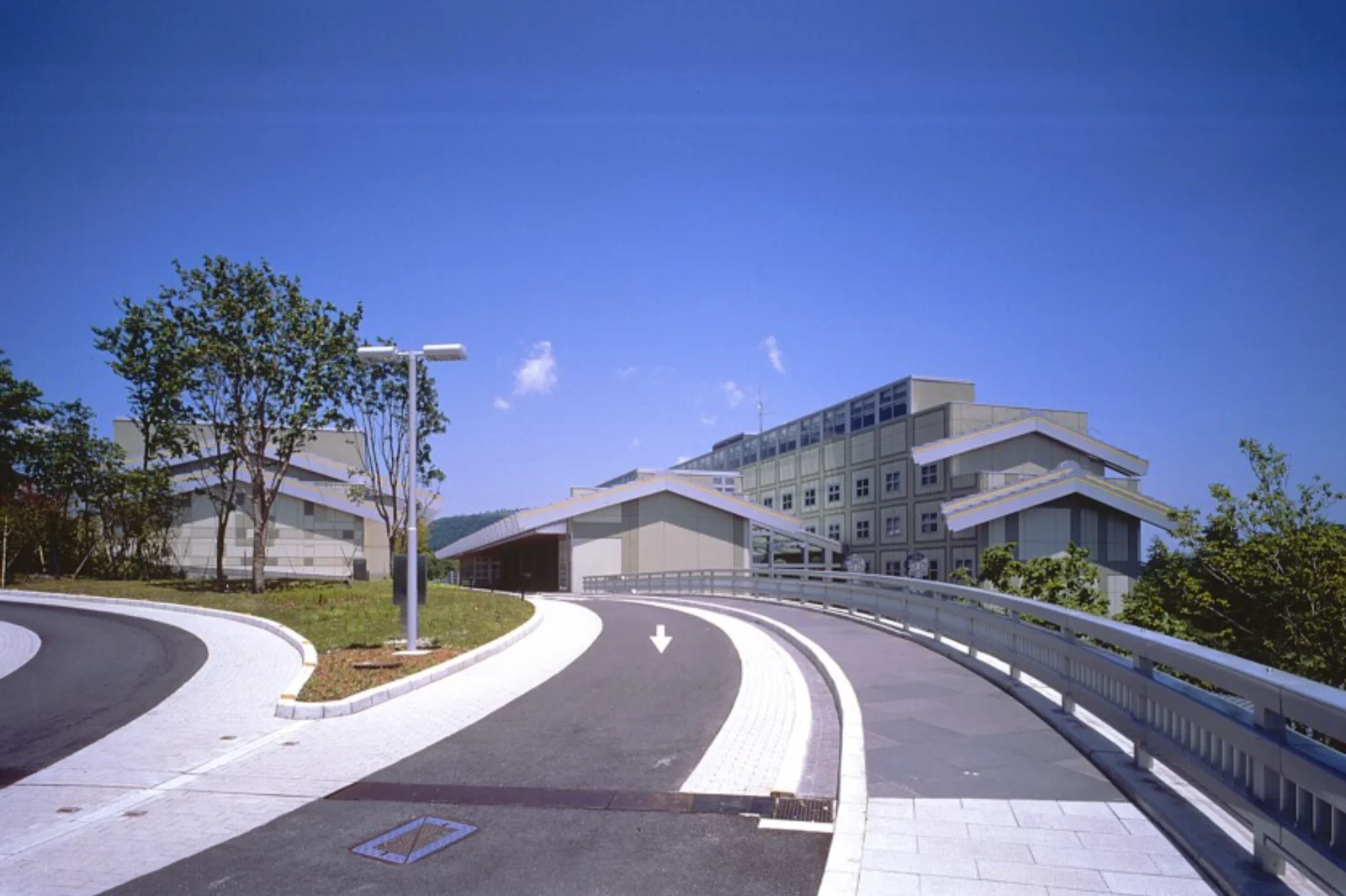
8. Seattle Art Museum (1991, Seattle, Washington, USA)

The Seattle Art Museum served as the institution’s new downtown home and marked one of the largest cultural projects undertaken by Robert Venturi and Denise Scott Brown in 1991. Located within Seattle’s urban core, the museum was designed to function not only as an exhibition venue but also as an active civic presence within the city.

The building responds to its dense urban setting through an articulated facade that addresses multiple streets and public spaces. The museum is composed of volumes, varied scales, and other architectural elements that help break down its overall mass. Materials, patterns, and geometric forms are used to create visual interest while establishing a clear public identity. Internally, the museum accommodates a range of galleries, public areas, educational facilities, and event spaces. The layout balances the technical requirements of art display with intuitive visitor circulation, creating a sequence of spaces that vary in scale and character depending on the type of exhibition.
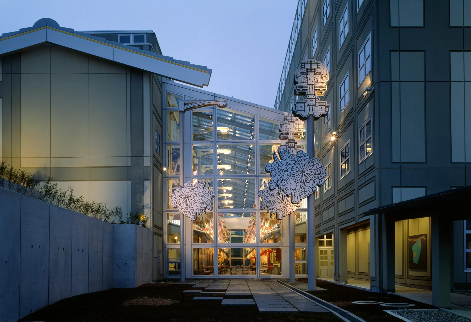
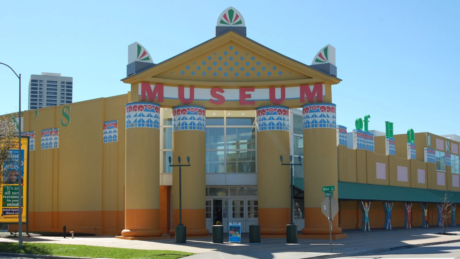
9. Children’s Museum Houston (1992, Houston, Texas, USA)

The Children’s Museum Houston was conceived as an educational facility that would engage directly with its young audience. Unlike many museums that rely on restrained architectural expression, the project uses color and scale to create an immediately recognizable public identity.

The building’s most prominent feature is its oversized classical portico, supported by large columns and topped by a brightly colored pediment. While these elements reference traditional civic architecture, they are deliberately enlarged and simplified, making them accessible and easily understood by children and families. The museum’s facade combines colors, graphic elements, and clear geometric forms, reinforcing the institution’s role as a place of learning and exploration.
Inside, the building accommodates interactive exhibits, educational spaces, and public gathering areas organized around visitor accessibility and flexibility.
10. Museum of Contemporary Art San Diego (1996 Expansion, La Jolla, California, USA)

Robert Venturi and Denise Scott Brown’s expansion of the Museum of Contemporary Art San Diego addressed the challenge of enlarging an institution that occupied a site shaped by multiple architectural layers and a prominent coastal setting in La Jolla. Instead of replacing the existing structures with a unified architectural statement, the project embraced the site’s complexity and incremental growth.

The expansion introduced new galleries, circulation spaces, and visitor amenities while maintaining connections to the museum’s earlier buildings. The architects used a combination of geometric forms, varied volumes, and framed openings to organize the addition around the existing campus. This approach allowed the museum to expand its exhibition capacity without overwhelming the scale and character of the site.
The design also responds to its coastal context with openings, terraces, and circulation routes that establish visual connections to the Pacific Ocean. Materials and architectural elements were selected to complement the existing structures while clearly distinguishing the new intervention from the original buildings.
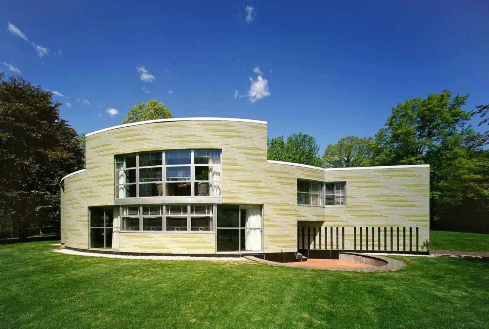
11. Nikko Kirifuri Resort (1997, Nikko, Japan)

Nikko Kirifuri Resort was developed as a hotel and leisure complex in the mountainous landscape of Nikko, Japan. The project required the architects to accommodate a large hospitality program while responding to the site’s natural setting and cultural context.

The resort is organized as a collection of interconnected volumes and not a single monolithic structure. This approach reduces the visual impact of the building within the landscape and allows the program to be distributed across the sloping terrain. Guest rooms, public facilities, circulation spaces, and recreational areas are arranged to maximize views of the surrounding mountains and forests.
The design incorporates references to Western and Japanese architectural traditions. Roof forms, geometric compositions, and decorative elements are used throughout the complex. The facades also combine varied materials, colors, and architectural motifs.
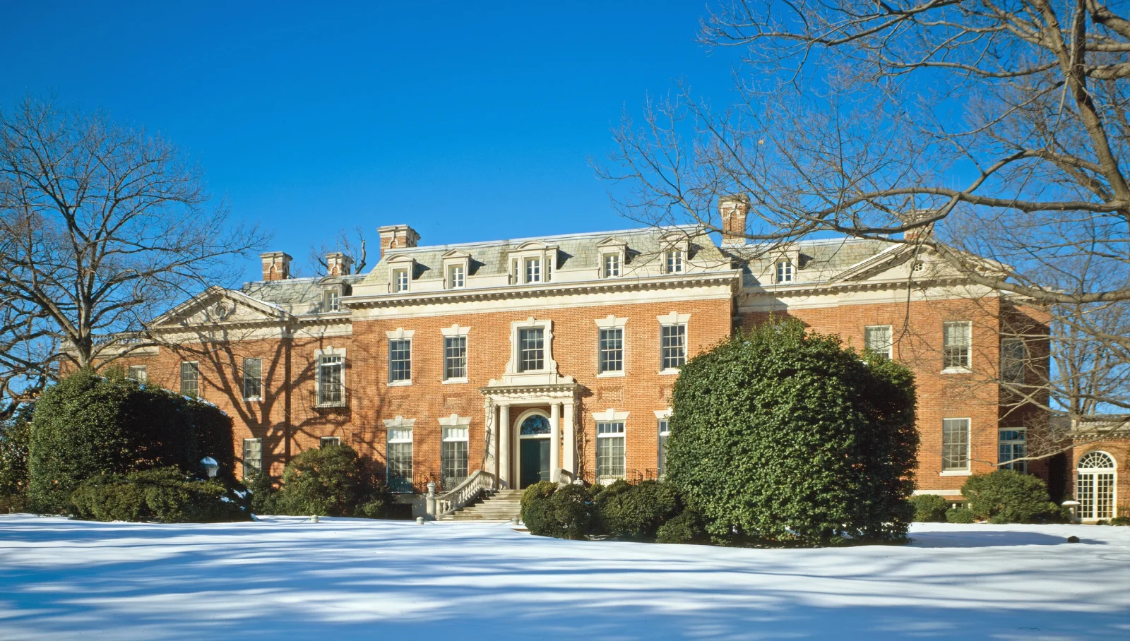
12. Dumbarton Oaks Visitor Center (2001, Washington, D.C., USA)

Designed for the historic Dumbarton Oaks estate in Washington, D.C., the visitor center was conceived as a gateway to the property’s renowned gardens, museum, and research facilities. The project required the architects to introduce new visitor amenities while respecting the character of a site with significant historical and cultural value.
The building accommodates reception areas, orientation spaces, ticketing facilities, a museum shop, and support functions. The design adopts a relatively modest scale and is integrated into its surroundings through its massing, materials, and landscape. The architects drew inspiration from traditional garden structures and pavilions, using classical references in a restrained manner: arches, symmetrical compositions, and openings. The building’s layout also establishes clear connections between interior spaces and the surrounding gardens, helping orient visitors as they move through the site.

A key aspect of the project is its emphasis on arrival and transition; the visitor center acts as an intermediary space between the city and the historic estate, preparing visitors for the broader Dumbarton Oaks experience.
Robert Venturi’s architecture often combined familiar forms with unexpected compositions, responded closely to context, and drew inspiration from architectural history as well as everyday culture.
Explore Courses
.jpg "Architecture Diagram Mastery: Concept to Portfolio")
.jpg%202.jpg "Building Performance with Forma & Opossum")


.jpg "Ondrej Chybik - Rethinking Architecture")


