


Milan Design Week has grown into one of the most important moments in the global design calendar. Every year, it brings together designers, architects, brands, and institutions from across the world.
What makes it different from other design events is that it is not limited to a single venue. The city itself becomes part of the exhibition. Installations spill into courtyards, palazzos, streets, and unexpected interiors.
Milan Design Week 2026 felt more like an active participant as spaces were reinterpreted. Some installations were sensory, working through light, sound, and movement. Others were focusing on material, craft, and simple spatial gestures. Across the city, there was a shift towards sustainability and digital tools, including AI.
This guide brings together a set of installations and pavilions from Milan Design Week 2026.
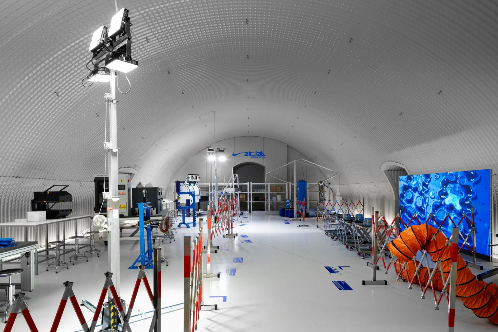
1. NikeAir_Lab by Nike x Dropcity

Instead of presenting finished products, this installation by Nike x Dropcity focused on the process. It did not focus on just a shoe but on a material that can be tested and designed. The space was organized around this idea. Archival pieces sat alongside machines and tool stations where visitors could see how air units were formed, compressed, and adjusted. Nearly 100 prototypes were displayed across the space, showing how the technology had evolved. Some were linked to athlete performance, others to experimentation and testing. Together, they built a clear picture of design as something iterative.

The spatial setting remained raw and industrial, in line with Dropcity’s larger vision as a space for production and research. The installation also acted as a preview. It hinted at a future permanent space dedicated to Nike Air, where research and production would continue beyond the design week.
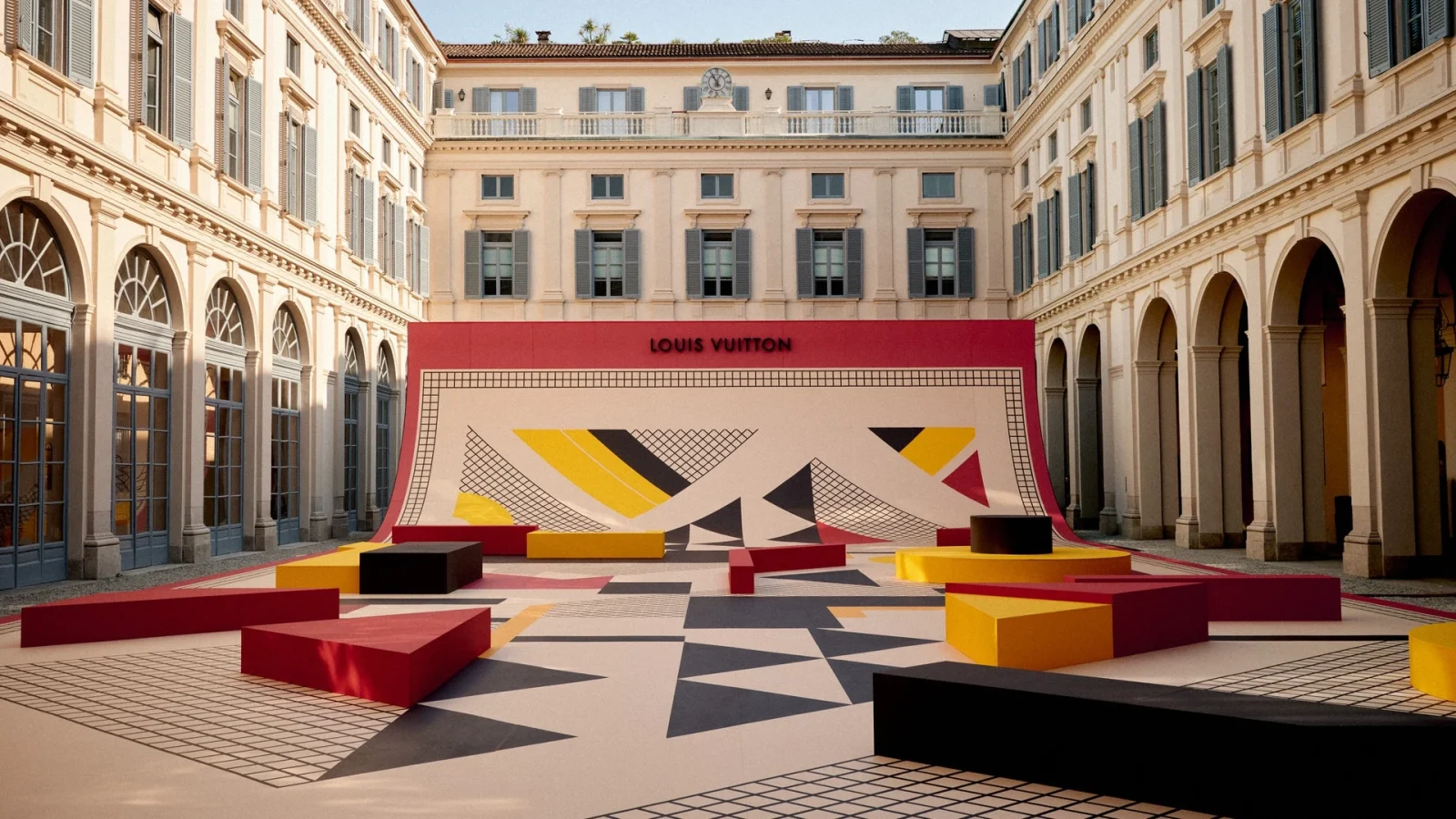
2. Objets Nomades by Louis Vuitton

At Palazzo Serbelloni, Objets Nomades was presented as a series of rooms you move through, each showcasing a different side of the brand’s design approach. One of the main references here was Pierre Legrain.
He was known for using simple shapes and strong geometry instead of heavy decoration. His work focused on material, surface, and proportion. You could see that influence in the exhibition, especially in the way furniture and textiles were designed. This reference also extended into the courtyard, where a dedicated installation drew from Legrain’s visual language. The space used geometric forms and composed surfaces, connecting the historic building with a more contemporary interpretation.

Inside, the newer Objets Nomades pieces felt more fluid. They were softer, more sculptural, and sometimes playful. Pieces like the Stella Armchair used textiles that changed visually as you moved around them, making the object feel active. There was also a section that looked back at the brand’s origins. Old trunks, drawings, and travel objects were displayed in a setting inspired by a 1920s train.
You moved from one room to another, from archive to contemporary pieces, without a sharp break. Materials like leather, wood, and fabric carried through the entire space, keeping it consistent.
3. Kaleido by MAD Architects

Set inside the Aula Magna at the Università degli Studi di Milano, Kaleido turned the idea of a kaleidoscope into a space you can walk through. The installation was developed by MAD Architects in collaboration with Canva, bringing together spatial design and digital creativity.
The installation was built as a 15-meter-long sequence of cubic volumes, arranged at different heights and wrapped in translucent, reflective panels. As you moved, light shifted across these surfaces, creating constantly changing reflections. The space never looked the same twice. It depended on your position, your movement, and the light around you. What anchored the project was its structure. The cubes formed a clear, repeatable system, and the space began to feel more fluid than its geometry suggested.

The experience was organized as a simple progression. You moved through four stages: Reconsider, Act, Realize, and Share, each shifting from observation to participation. At the center, an interactive zone allowed visitors to experiment with AI-assisted tools, linking physical movement with digital output.
4. Ooooh, That’s EpiQ! by Ricardo Orts

Developed by Ricardo Orts of Ulises Studio for Škoda Auto, Ooooh, That’s EpiQ! took its cue from modeling clay. The entire space was built around this idea. Forms were rounded, surfaces felt molded, and nothing looked rigid or fixed. Sculptural elements sat across the courtyard, including a clay-like interpretation of the Epiq car itself. Instead of presenting the vehicle conventionally, it became part of a larger spatial story. The layout was open and easy to move through.

Different zones were placed across the space, some for interaction, some for pause. There were areas where visitors could try clay modeling and others where they could sit, rest, or even take part in activities like yoga sessions and talks. At the center, a digital dome added another layer.
Visitors could also engage with projections and create AI-generated avatars. This shifted the installation from something purely physical to something that also responded digitally.
5. Città delle Idee by Mario Cucinella Architects

At Solferino 28, Città delle Idee looked at the idea of a city in a very simple way. Not as something fixed, but as something that could change, grow, and adapt. The installation was built using 3D-printed modules. Instead of adding more material, the system was designed to use less. Parts were reduced, hollowed out, and assembled to avoid waste. This made the whole structure feel light, almost unfinished, but that was intentional. There were no solid walls or closed spaces. The elements came together to suggest rooms and paths, but they never fully defined them. You could move through it freely, see across it, and understand how it was put together at the same time.

What it pointed to was a different way of thinking about cities. One where buildings were not heavy and permanent, but flexible and open to change. It also brought in new ways of building, where digital tools and material efficiency went hand in hand.
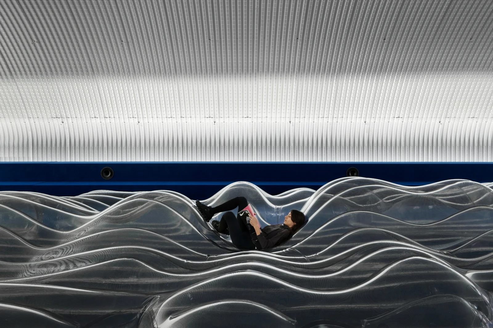
6. Serotonin – The Chemistry of Happiness by Sara Ricciardi

Inside the Loggia of the Pinacoteca di Brera, the installation was created by Sara Ricciardi for American Express. Serotonin – The Chemistry of Happiness looked at how space could affect emotion.

The installation was made of soft, inflated forms that slowly expanded and contracted. The movement was gentle and repetitive, almost like breathing. Light played an important role. It was controlled and even, helping the forms read as one continuous surface. Nothing stood out too sharply. Everything came under a single atmosphere. The historic structure of the Brera Loggia remained visible, but the installation softened it. The contrast between the solid architecture and the moving, air-filled forms made the experience more noticeable. There was no clear start or end. You entered, stayed for a bit, and left when you wanted.
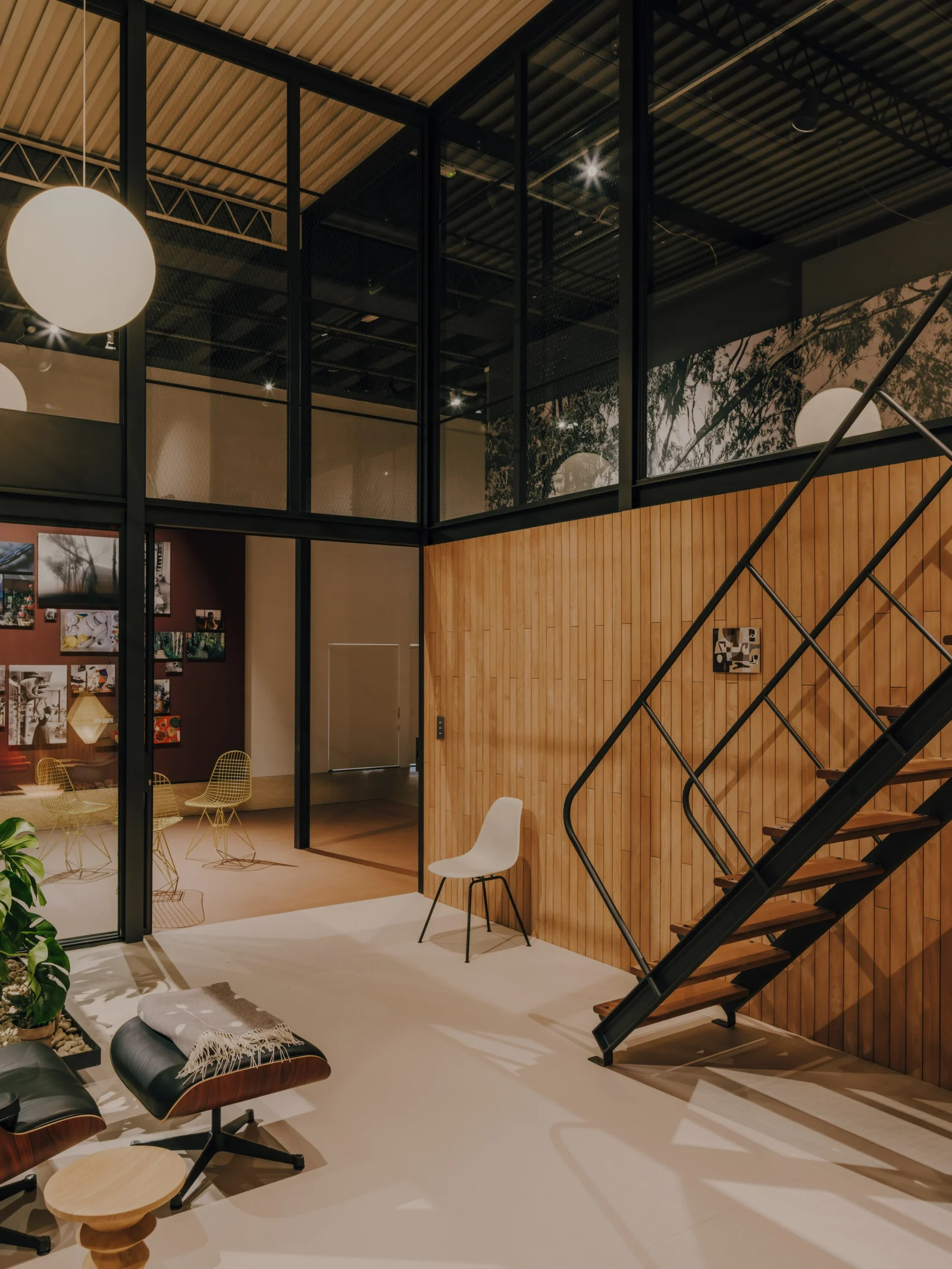
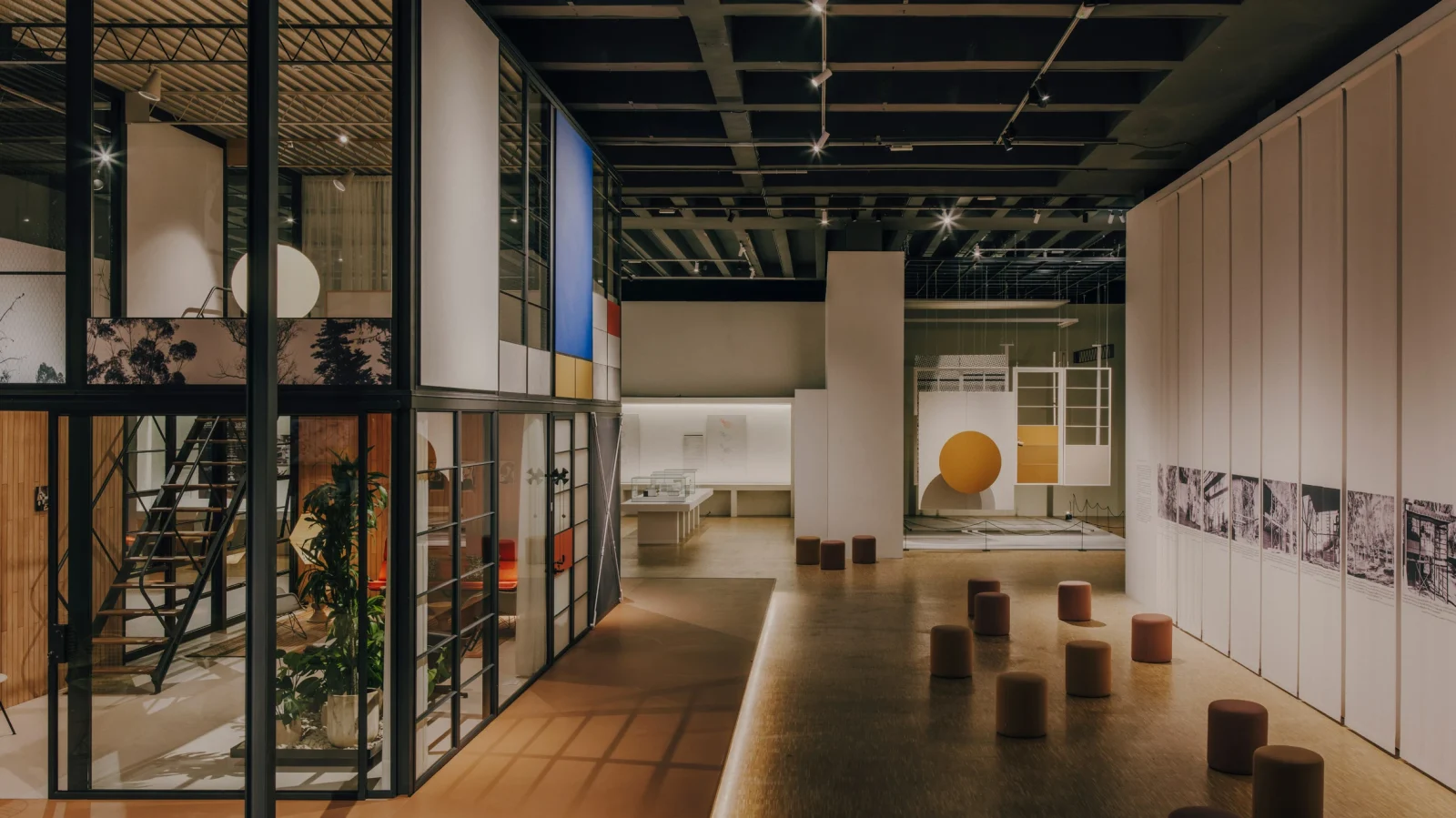
7. The Eames Pavilion System by Triennale Milano

The Eames Houses exhibition brought back the architectural thinking of Charles Eames and Ray Eames. At the center was the Eames Pavilion System, developed by the Eames Office with Kettal. It was a modular building system based on ideas the Eameses explored in the 1940s and 1950s, especially in their own home, Case Study House No. 8.

The system was simple to understand. It used a clear grid and a set of repeatable parts. These parts could be combined in different ways to create small pavilions or larger, two-storey structures. Walls, roofs, and panels can be swapped, adjusted, or replaced depending on how the space is used. The focus was ideally on efficiency and flexibility. The structure used a light frame, allowing more open space inside while keeping the footprint small. It was designed to be assembled, taken apart, and adapted over time.
Inside the exhibition, you could walk through a full-scale version of this system. Alongside it were models, drawings, and films that showed how these ideas developed, not just in built projects but also in proposals that were never realized.
8. Fuorisalone: Be the Project

Spread across the city, Fuorisalone was not a single installation but a network of spaces, courtyards, streets, and buildings that together turned Milan into a temporary design landscape.
In 2026, the theme Be the Project set the tone. It worked on two levels. On one hand, it positioned people as active agents of change, with their own ideas, responsibilities, and ways of shaping the world. On the other hand, it framed design as an ongoing process, something that continuously shapes relationships between people, objects, and environments. This idea of “becoming” ran through the entire week.

Over a thousand installations, exhibitions, and events unfolded across the city, often bringing overlooked buildings and forgotten spaces back into use. Historic palazzos, courtyards, and industrial sites were temporarily transformed, creating new design pop-ups within the existing urban fabric. Installations focused on sensory experience, using light, sound, and movement. At the same time, collaborations across disciplines, between design, fashion, and technology, became more visible.
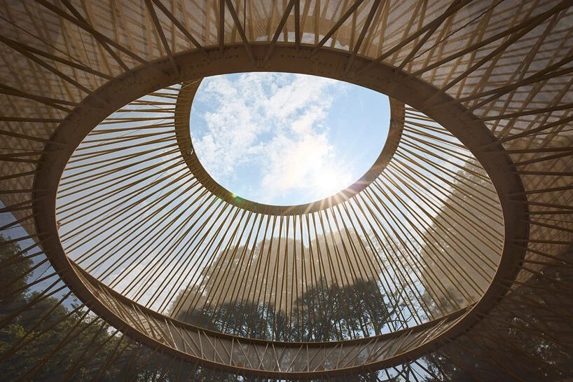
9. Uzbekistan Yurt-Inspired Pavilion: When Apricots Blossom

At Palazzo Citterio, When Apricots Blossom brought Uzbekistan to Milan Design Week 2026 for the first time, using architecture and craft to tell a larger story about land, culture, and change.
At the center of the project was a garden pavilion inspired by the traditional yurt, reinterpreted by Kulapat Yantrasast. Instead of recreating the yurt as it is, the structure was opened up and simplified. Its familiar lattice framework was pulled apart and reassembled into a lighter, more transparent form. The original yurt was built for movement. It was designed to be assembled, taken down, and carried across landscapes.

The pavilion becomes a space for gathering, hosting talks, workshops, and conversations. The exhibition around it was organised through three themes: food, shelter, and textiles. These come from research across Karakalpakstan, a region deeply affected by the shrinking of the Aral Sea. Crafts like bread-making, yurt-building, and weaving were presented as ways of responding to environmental conditions. There was also a film component that extended this narrative, connecting the physical installation to a wider landscape and its ongoing changes.
10. USM “Breathing Space” by Annabelle Schneider and Snøhetta

Set in the garden of Fondazione Luigi Rovati, Breathing Space felt very different from most installations at Milan Design Week 2026. The structure was built using the USM Haller system, which is usually used for storage furniture. Here, it became a simple metal frame that held the space together. Around it, a soft fabric membrane was stretched and filled with air.

The membrane gently expanded and contracted, as if it were breathing. It was not dramatic, but you noticed it after a while. The space felt alive in a very subtle way. Inside, everything was kept simple. The hard grid of the structure sat next to soft cushions and fabric forms. You could sit, lie down, or just stay there for a bit. Light was soft, sound was reduced, and the whole space felt calm.
There was no main object to look at. The experience was about being inside the space rather than moving through it quickly.
11. 5VIE

In the historic centre of Milan, around Sant’Ambrogio and Corso Magenta, 5VIE was like a route you move through. For 2026, the theme QoT – Qualia of Things shifted the focus from how things functioned to how they felt. It drew from the idea of “qualia”, the personal, sensory experience of something. Instead of talking about technology and connectivity, the emphasis moved toward touch, sound, light, and emotion.
The district was spread across courtyards, old buildings, galleries, and reused spaces. You did not enter one venue and leave. You walked through the neighbourhood, discovering installations along the way. The main starting point was the Cavallerizze at the Museo Nazionale Scienza e Tecnologia, from where the rest of the route unfolded.

Some projects focused on material. Others on the atmosphere. A few use simple systems that change as you move through them. Installations made from reused banners turned into walk-through textile spaces. Fabric and sound were used to create environments. Many works looked at traditional techniques and reworked them into something contemporary. Wood, ceramic, glass, and textile were treated as active materials.
12. Isola

What began as a local initiative grew into one of the key parts of Milan Design Week 2026. For its 10th edition, the theme TEN: The Evolving Now looked both backward and forward. It revisited earlier formats while introducing new collaborations and ideas.
The district was made up of studios, courtyards, galleries, and temporary spaces. Like 5VIE, it was something you walked through rather than entered as a single venue. But the scale here felt more intimate. Projects were closer, more hands-on, and often more direct. A major part of this year’s program was Archivi Futuri, which looked at how objects and ideas could continue to exist over time. It brought together questions around materials, craft, and digital tools, including the role of AI in preserving and extending knowledge.

There was also a strong presence of emerging designers. Some returned after first showing here years ago, now with more developed work. Others were new, adding to the mix. Isola was all about the process behind the work. You could see how things were made, how materials were tested, and how ideas evolved.
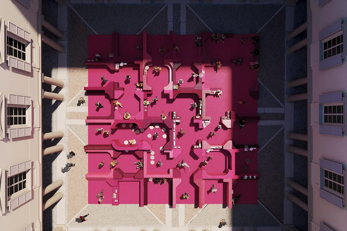
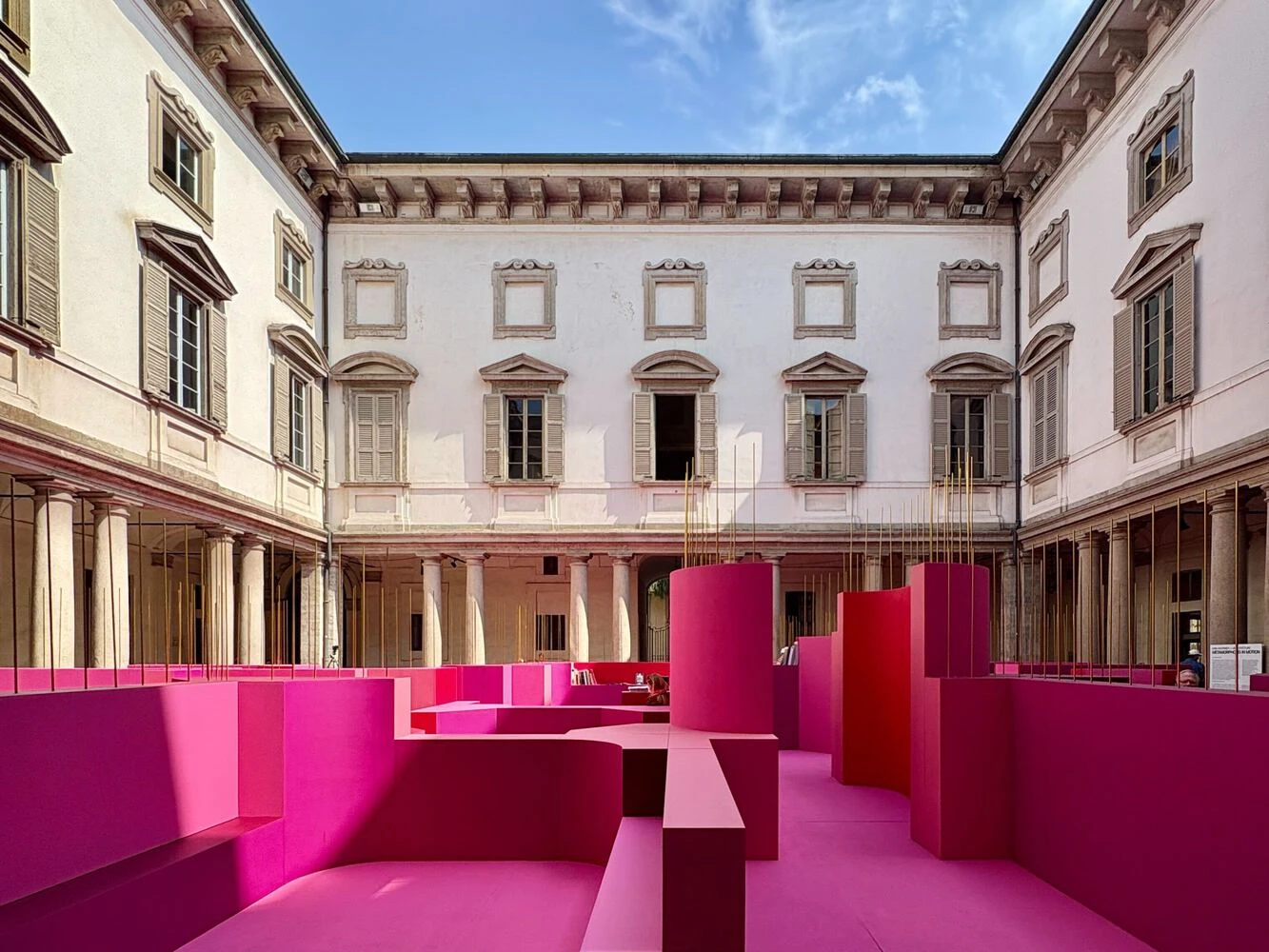
13. Metamorphosis in Motion by Lina Ghotmeh

Metamorphosis in Motion was placed in the courtyard of Palazzo Litta. Designed by Lina Ghotmeh as part of MoscaPartners Variations, the installation sat within the Baroque courtyard but did not follow its symmetry. Instead of straight lines and clear axes, it introduced curved forms and a more fluid layout.

The pavilion was organized like a loose maze. As you moved through it, the space kept shifting. Views opened and closed, paths overlapped, and there was no single way to walk through it. The experience depended on how you moved. Light, shadow, and movement began to change how the original space was perceived.
The idea of transformation was central here, but it was not shown through one fixed form. It happened over time. As people moved, as light changed, the space kept adjusting.
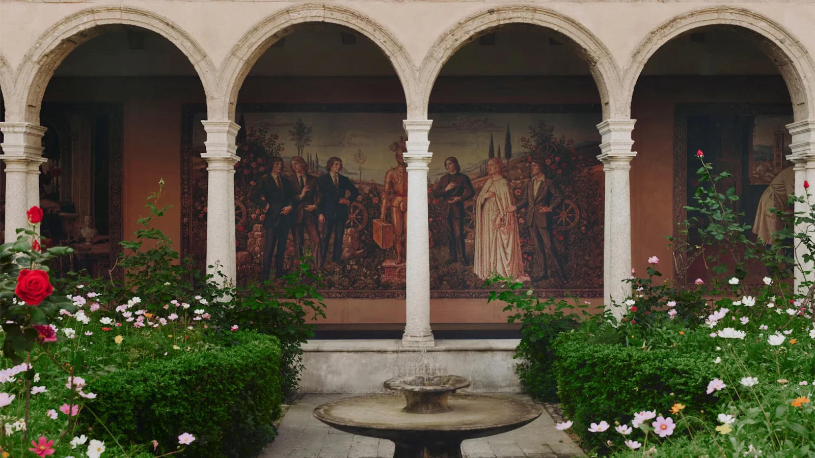
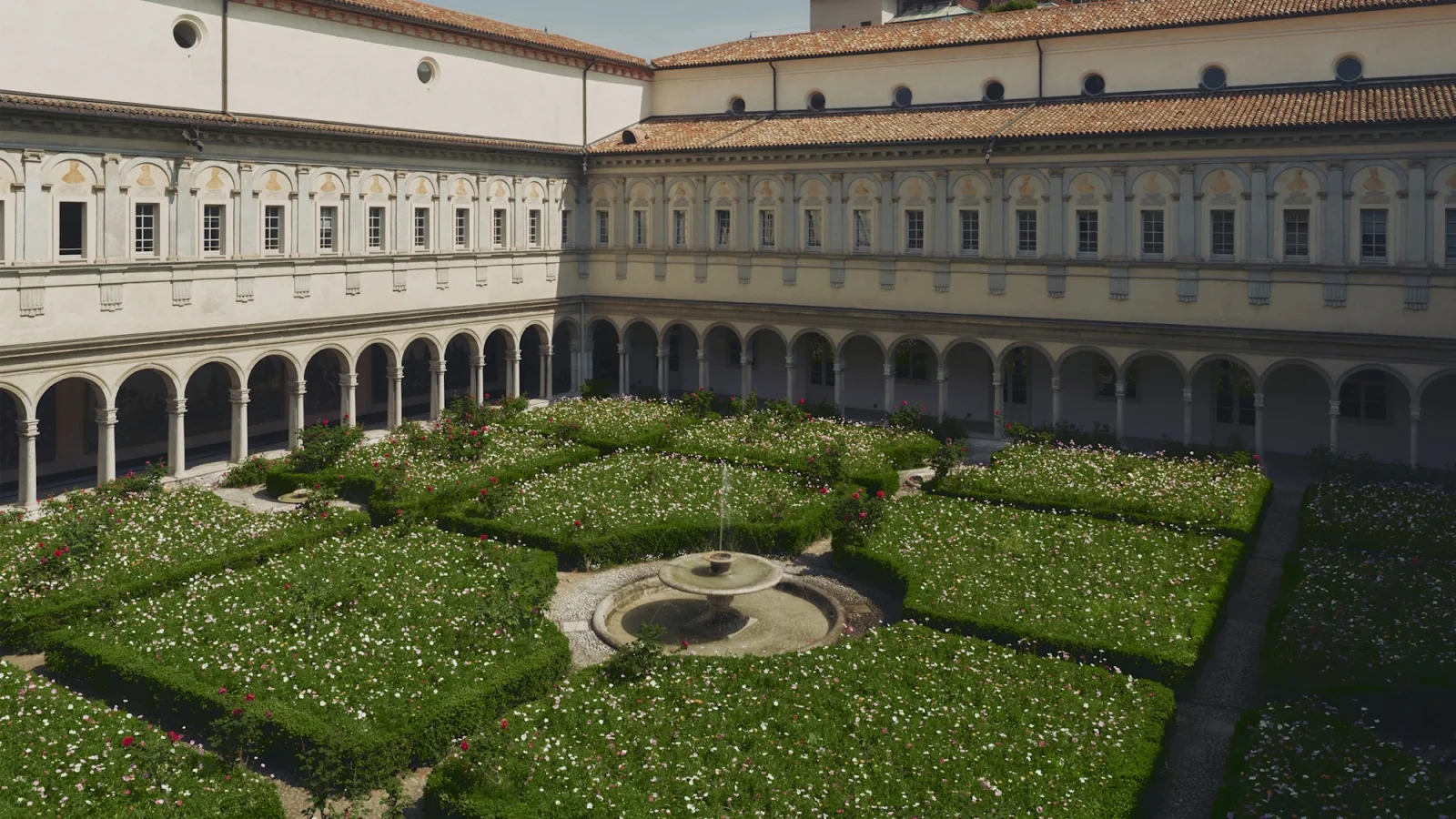
14. Gucci Memoria

Set within the Chiostri di San Simpliciano, Gucci Memoria reads like a walk through time. Curated by Demna, the exhibition traced the House’s 105-year history, but it does not follow a straight timeline. Instead, it moved between past and present.

In the main cloister, a garden installation took over the courtyard. Seasonal flowers, inspired by Gucci’s Flora motif, created a soft, almost familiar setting. It felt calm, but it also carried the idea of change, something that grew, faded, and returned. Inside, the narrative continued through a series of tapestries. They acted like scenes, moving from Guccio Gucci’s early years to the present. Through shifts in color, setting, and composition, you began to read how the brand evolved.
The smaller cloister introduces a different tone. Custom vending machines dispensed canned drinks inspired by “La Famiglia”, created by Gucci Giardino in Florence.
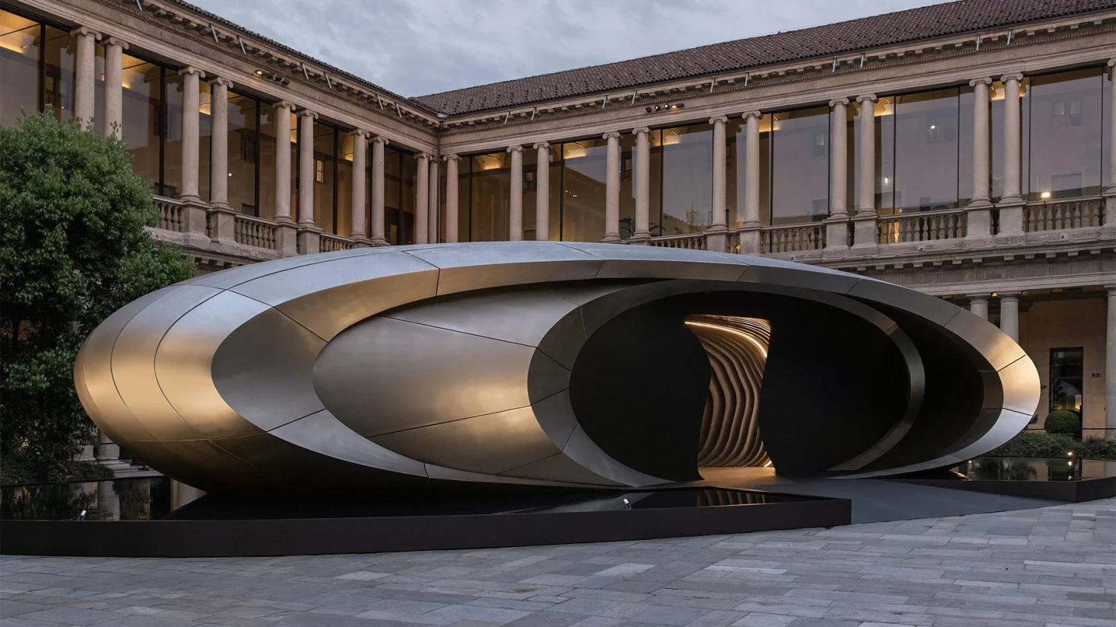
15. Origin by Audi x Zaha Hadid Architects

Designed by Audi in collaboration with Zaha Hadid Architects, Origin is centred on a sculptural pavilion. Its form was clean and controlled, built with smooth lines and matte titanium surfaces that stood in contrast to the surrounding Renaissance architecture. It was set within the courtyard of the former Archiepiscopal Seminary, now the Portrait Hotel.
The pavilion did not rely on movement, but it still changed. As light shifted through the day, reflections moved across its surface. Shadows stretched and softened. The object stayed the same, but how you saw it keeps changing. The space was kept minimal, and there were no distractions around it. This was intentional, and the installation was meant to counter sensory overload.
At the same time, it connected to Audi’s larger direction. The pavilion was framed as a gesture toward the brand’s future, while also marking its entry into Formula 1 and the launch of new models like the RS 5. These references remained in the background, allowing the space itself to stay central.

These installations transformed Milan into an immersive design landscape, where material experimentation, sensory storytelling, and human-centered thinking redefined how space was experienced, shared, and remembered across the city.
Explore Courses


.jpg "Ondrej Chybik - Rethinking Architecture")


