


Most people notice wayfinding only when it fails.
You miss the lobby desk. You walk past the elevator bank. You reach a dead-end corridor and double back. In each case, the problem is not really the sign by itself. It is the gap between architecture, circulation, and information. A building may look refined in renderings and still feel hard to read once people start moving through it.
That is why good wayfinding in architecture should not be treated as a late graphic package. It starts much earlier, when architects decide what visitors see first, what they recognize next, and how a building quietly confirms that they are heading in the right direction.
When that thinking is built into the project, signs stop feeling like add-ons. They become part of the spatial logic.

Why wayfinding starts before signage
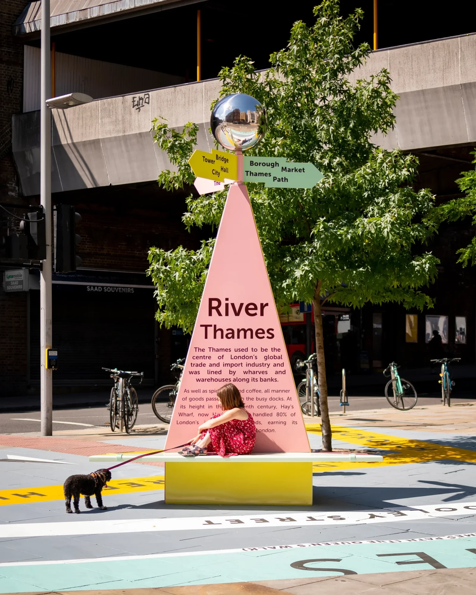
Wayfinding begins with a sequence. Before anyone reads a room number or a directory, they are already taking cues from massing, light, thresholds, sightlines, and material contrast. A strong entrance reads like an entrance. A public route feels more public than a staff corridor. A reception desk sits where people expect help to be.

This is one reason many of the best projects rely on architecture to do part of the navigational work. In many retail environments, the facade, entry framing, and interior sightlines already guide the visitor toward the main path of travel. In projects shaped by luxury retail facade designs, exterior expression often does more than support branding.
Signs matter, but they work best when the building has already done some of the work.
Good wayfinding does more than prevent confusion
People often frame wayfinding as a problem of preventing users from getting lost. That is too narrow. In practice, good wayfinding reduces small points of friction all the way through a visit.
In an office, that might mean helping a first-time guest find the reception without asking for help. In a hospital, it can reduce stress when people are already overloaded. In a campus or civic building, it can make circulation feel calm instead of ambiguous. In hospitality, it helps a space feel polished because visitors are not stopping every few minutes to decode where they are.

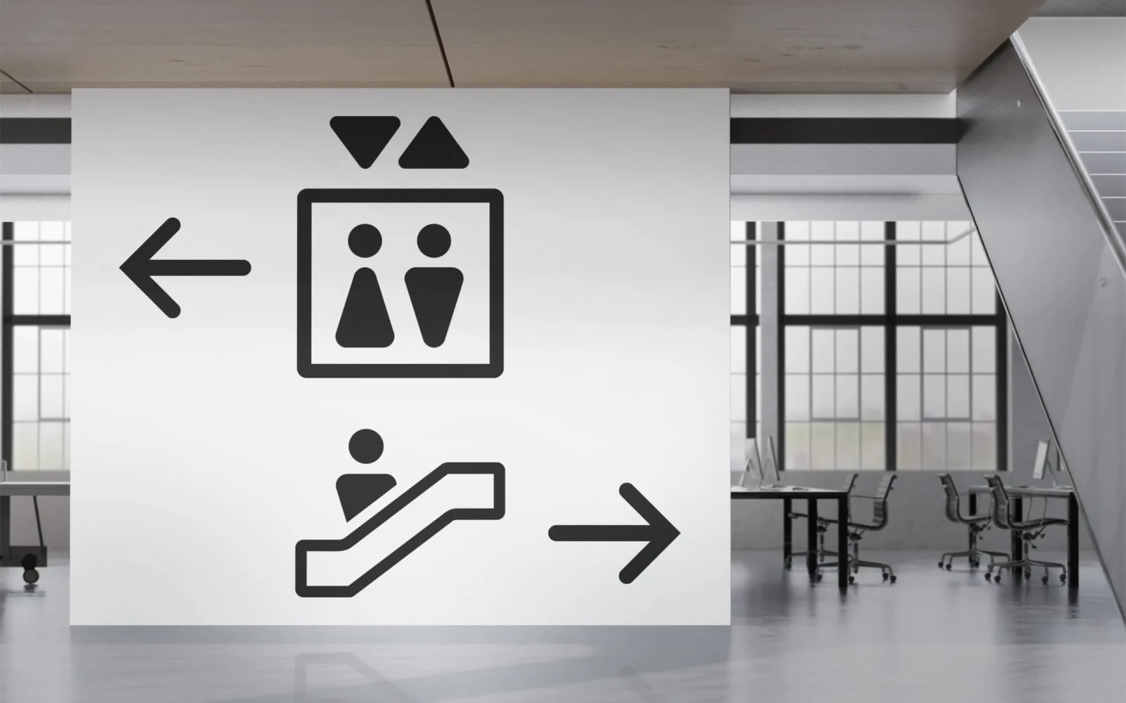
The strongest systems usually do three things well. They confirm where you are. They show where to go next. They reassure you along the route. That may sound simple, but it depends on consistent placement, legible typography, sensible naming, and materials that still read clearly under real lighting conditions, not just in a mockup.
At Google’s Kirkland campus, the wayfinding scheme paired signs with architectural color treatments at entry points instead of relying only on standalone graphics, reinforcing orientation before visitors had to stop and read.
Sign materials matter as much as lettering
Architects tend to spend a lot of time discussing typeface, hierarchy, and sign location. All of that matters. But material choice often decides whether signage feels temporary, institutional, premium, or fully integrated with the architecture.
Acrylic can feel crisp and contemporary. Powder-coated metal can feel sharp and efficient. Wood can soften a space and work well in hospitality or cultural settings. Bronze occupies a different lane. Used well, it brings weight, permanence, and a civic quality that lighter materials do not always carry.

That is why bronze still makes sense in courthouses, libraries, universities, memorial settings, legacy hospitality properties, and high-end office environments. It can bridge architecture and identity without turning the sign into a sales feature. In the right setting, dimensional metal identifiers such as cut bronze lettering can handle donor recognition, reception naming, room identification, or exterior building IDs in a way that feels durable and architecturally grounded rather than decorative.
The important point is not that one material is universally better. It is that sign materials should match the life of the building, the expected wear, the viewing distance, and the tone of the space. A temporary-feeling material in a permanent civic environment creates dissonance. So does overly formal material in a casual, high-turn retail setting.
Accessibility is not a side requirement
A surprising amount of signage still gets treated as a visual styling exercise first and an accessibility issue later. That is a mistake, especially in the US market.
The U.S. Access Board’s ADA guidance for signs makes clear that accessible signage is not just about putting Braille somewhere on the wall. The standards address visual and tactile requirements, sign location, permanent room identification, contrast, and other technical considerations that shape how signs function in real buildings. They also note that tactile requirements primarily apply to signs located at doorways because those locations give users a reliable cue for finding signs by touch.

For designers, that changes the conversation. Accessibility is not a finishing step after the concept is approved. It affects placement, wall conditions, mounting logic, content hierarchy, and in some cases even how rooms are named. If the architecture leaves no clear place for compliant signage, the problem started upstream.
This is another reason why wayfinding should be brought into the design process early. The best systems do not bolt ADA compliance onto an otherwise visual scheme. They make legibility, reach, contrast, and consistency part of the design language from the start. Federal design workflows reflect that thinking too: GSA’s current P100 materials and submittal framework treat signage and wayfinding as part of formal project documentation rather than an optional late-stage extra.
Where architects usually get signage wrong
The most common failure is not “too few signs.” It is a mismatch.
Sometimes the naming system is too clever for the building. Sometimes the signage family looks refined up close, but disappears at approach speed. Sometimes the material looks good in isolation, but does not hold contrast against the surrounding wall. And often, the route itself is not clear enough for the signs to rescue it.

Another common issue is inconsistency. One floor uses directories at the elevator lobby. Another relies on wall-mounted arrows deeper into the corridor. One entrance foregrounds a reception desk. Another leaves visitors staring at a blank wall and a side hallway. People may still get there, but the building feels harder than it should.
In many Apple Store architecture examples, circulation and spatial cues do much of the orientation work before signage needs to step in. The lesson is not that every building should look like a flagship store. It is that spatial clarity lowers the burden on signs.
Libraries offer another useful model. In large public reading spaces, visitors need to understand entry, service points, quiet zones, collections, and vertical circulation without constant staff intervention. Many beautiful libraries show how architecture, shelving rhythm, light, and focal points can support wayfinding before a single directional arrow is read.
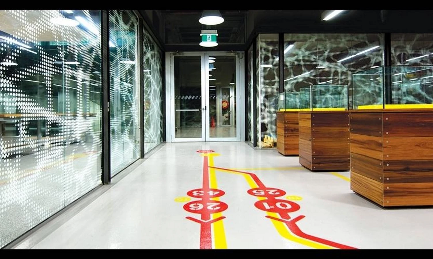
Designing signs as part of the architecture
The most reliable approach is to design wayfinding as a layered system.
The first layer is architectural: entry sequence, visibility, circulation hierarchy, and major destination points. The second is environmental: lighting, material contrast, acoustics, and landmarks that help people build a mental map. The third is informational: names, numbers, arrows, directories, and confirmation signs.

When those layers align, signage does not have to shout. A directory can be smaller because it appears exactly where it should. A room identifier can be quieter because the corridor is already legible. Exterior lettering can feel natural because it grows out of the material language of the facade rather than fighting it.
This also tends to produce better-looking buildings. Good wayfinding is not only a user-experience win. It improves visual discipline. It reduces ad hoc fixes. It limits the slow creep of temporary notices, taped arrows, and improvised plaques that often appear when the original design did not fully solve navigation.
That matters over time. Buildings rarely get simpler after opening. Tenants change. Departments move. New security rules appear. Programs expand. A coherent wayfinding system gives the architecture a better chance of absorbing those changes without visual clutter.
Good wayfinding should feel natural
The best compliment a wayfinding system can get is that nobody talks about it. People simply move through the building, understand where to go, and feel that the environment makes sense.

That outcome is rarely accidental. It comes from treating signs as part of the design rather than post-design decoration. It comes from choosing materials that fit the building’s character and lifespan. And it comes from understanding that wayfinding in architecture is not just about labels on walls. It is about how space, information, and movement work together.
When those pieces line up, the signage does not interrupt the architecture. It completes it.
Explore Courses
.jpg "Ondrej Chybik - Rethinking Architecture")


